1 Introduction
As people’s material living standards continue to rise, the pursuit of a comfortable and elegant living environment has become a fashion. The diversification and individualisation of home decoration requires more vibrant decorative fabrics, and the colourful patterns and bright colours of the heat transfer printing process products are just the thing to set the mood. When purchasing goods, consumers pay attention to the quality and performance of the goods on the one hand, and increasingly demand more and more from the packaging on the other. As a product, it should at least meet the following requirements: firstly, it should be able to attract the consumer’s attention in the first instance; secondly, it should be able to stand out from the crowd of similar products. This will have a direct impact on the consumer’s perception of the product and ultimately on whether or not they make a purchase decision. Heat transfer printing is the process of printing a pattern onto paper and then transferring the pattern from the paper to the textile through a heat transfer machine.
1.1 Introduction to high temperature heat transfer printing technology
Heat transfer printing [2] is an extension of printing technology in the textile industry, where the uneven surface of the fabric has many pores, making it difficult to obtain a very fine pattern compared to paper printing. Heat transfer printing is therefore a process whereby the ink is first printed on paper by means of a printing press and then the surface of the fabric is placed in a quasi-flat state by means of a heat transfer machine, which transfers the pattern from the paper to the fabric by means of the sublimation of the dyestuff in the ink and by means of heating and pressure.
In terms of the process used to complete the printing of printed paper, there are various printing methods such as screen printing, flat printing, gravure printing, letterpress printing and digital printing. In practice, the appropriate printing method can be chosen depending on the type of pattern to be printed and the ink used.
1.1.1 Screen printing method
Screen printing [3] is currently the most used method of printing for thermal transfer printing paper. The principle of screen printing is that the ink is transferred through the gaps in the aperture plate to the substrate under a certain amount of pressure.
The text is formed on the object. The principle of operation is shown in Figure 1-1.

1 – Stencil that can be turned 2 – Ink 3 – Squeegee 4 – Substrate
Fig.1 the principle of screen
The wide range of materials used for screen printing means that any material, except air and water, can be used as a substrate, so screen printing is highly adaptable and has a wide range of applications.
The ink layer is thick and has a strong three-dimensional appearance. The thickness of the ink layer is usually around 30-50 microns, giving a rich texture to the print, which is unique to screen printing. Silk screen printing can be done in single colours and in sets of colours with coloured screens.
③ High lightfastness and vivid colours. Silk screen printing can be used to determine the number of threads that can be missed depending on the screen.
The dots can be used so that coarser grained inks can be used.
④ Large printing widths. With a maximum width of 3m x 4m, the screen printing product is able to meet the needs of large-format textile screen printing.
1.1.2 Offset printing methods
Offset printing, also known as lithographic printing, is a method of printing in which the image on the printing plate is transferred to the substrate by means of a rubber cylinder. The printing principle is illustrated in Figure 1-2: during the printing operation, the principle of the immiscibility of oil and water is used to first apply water to the plate cylinder, then ink to the plate cylinder, and under the action of the printing pressure, the ink is transferred to the substrate through the rubber cylinder.

Fig.2 the principle of lithograohy
The main characteristics of offset printing are: the clarity of the print and the high reproducibility of the dots. It is a classic printing method and is used in the printing of high-quality printing paper. At present, in the thermal transfer
Not very commonly used in printing on printed paper.
1.1.3 Gravure printing method
Gravure [5] plates have the graphic part of the plate lower than the layout, and the different layers of the graphic are represented by the screen cavities, with the blank part of the plate in the same radius. When printing, the ink is first coated on the printing plate, the squeegee scrapes the ink off the blank part of the printing plate, the role of pressure, the ink of the graphic part of the printing plate and the substrate material contact transfer to the substrate. The printing principle is illustrated in Figure 1-3.
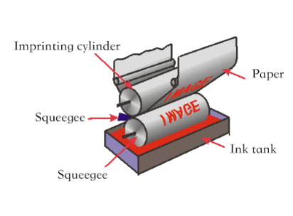
Figure 1-3 the principle of gravure
Gravure printing is widely used in the fields of plastic flexible packaging printing and transfer printing. Gravure printing is characterised by thick ink layers, vibrant colours, high print resistance and rich layers. Gravure printing has a large number of colours, a wide width and is often used for spot colour printing, which is an advantage in the printing of thermal transfer paper. Gravure printing is the main focus of this study.
1.1.4 Flexo printing method
Flexography is a direct-rotation printing method that uses a flexible, raised resin printing plate to transfer ink through anilox rollers and squeegees. The printing principle is illustrated in Fig.
1 – 4 shown.
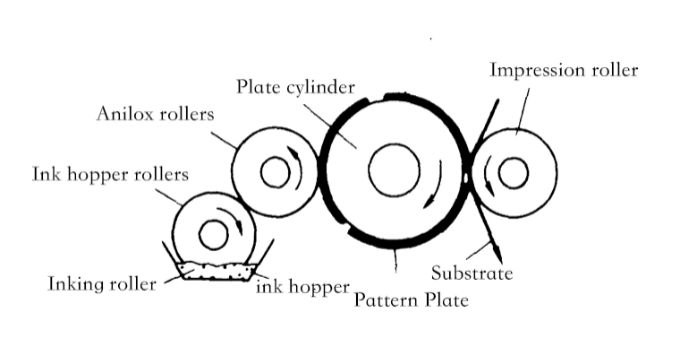
Fig. 1 – 4 the principle of flexgraphy
The greatest advantages of flexographic printing in the printing of thermal transfer paper are.
① A wide range of materials are available for printing.
It is possible to print paper and cardboard in different weights (28 to 450 g/m2). Currently used in corrugated board, plastic film, aluminium foil, self-adhesive paper, cellophane, metal foil, etc.
②Green and fast drying inks can be used.
Flexo printing uses water-based or UV inks that are environmentally friendly and non-polluting. Flexo printing is therefore one of the trends in the development of thermal transfer printing.
1.1.5 Digital printing methods
Digital printing is a process whereby the image to be printed is first entered into a computer and then, through the relevant RIP-controlled digital printing machine, directly printed onto thermal transfer printing paper; after the thermal transfer process, a highly accurate image with rich colours and fine layers is obtained on the textile fabric. Digital printing will become the mainstay of the printing industry and is another trend in the development of thermal transfer printing methods.
1.2 High temperature heat transfer technology
1.2.1 Principle of thermal transfer printing
Depending on the customer’s requirements, inks containing disperse dyes at 150°C to 230°C are selected and the image to be printed is transferred to the printing paper by means of printing. The transfer is carried out by means of a heat transfer machine, at a certain temperature, time and pressure, to transfer the image from the transfer paper to the textile, where the disperse dyestuff is diffused into the textile for colouring purposes.
This method is not only quick and easy but, more importantly, less costly than the usual embroidery and multi-colour overprinting methods. Today, transfer printing on textiles is used in a wide range of industries, such as the decorative sector, the printing and dyeing industry, leather and ceramic products and the printing of travel advertising brochures. The different applications for transfer printing require different qualities of transfer paper, which is why different types and qualities of printing paper are now available on the transfer market.
1.2.2 Thermal transfer method
Transfer printing There are many ways to accomplish heat transfer printing on different products, commonly used are sublimation
The sublimation method is the most developed method, and the fusion method, the ink layer peeling method. The sublimation method is currently the most mature.
(1) Sublimation method
The sublimation of the disperse dyestuff in the ink is used to form the ink by mixing the disperse dyestuff with a water-soluble or alcohol-soluble carrier. When the temperature is heated to 200 to 230°C and the action time is 20 to 30 seconds, the dye sublimation penetrates into the fabric and the sublimation method undergoes three stages: Stage 1: the entire dye is concentrated in the printing layer on the transfer paper. the fabric is also heated and the
When the working temperature is reached, the dyestuff begins to be absorbed on the surface of the fabric fibres and diffuses within the fibres until a saturation value is reached within the fibres. Stage 3: In order to diffuse the dye from the paper into the fibres, the fabric is evacuated to ensure that the dye diffuses from the fibres in the paper into the fibres inside the fabric, thus achieving a directional diffusion of the dye. Ultimately, the fibres of the textile are dyed, the dye content of the paper fibres is reduced and any residual dye in the paper fibres is transferred to the inside of the paper.
(2) Swim Shift Method
The textiles are first treated with a colour paste dip, which is heated and pressurised in a wet state to complete the swim transfer, where the dye in the colour paste is transferred from the printing paper to the textile fibres under the effect of the heat pressure and the colour is fixed. The dyestuff in the ink layer of the transfer paper is selected according to the nature of the paper fibres. After fixation, the textile is subjected to post-treatment such as gas steaming and washing. The disadvantage of this process is the high pressure required to complete the process.
(3) Melting method
The components of the colour paste, such as dyes and waxes, are heated and pressurised to a molten state, when the components of the colour paste are embedded in the textile from the transfer paper and the dyes are transferred to the fabric fibres. Then the post-treatment such as solid colour.
(4) Ink layer peeling method
The choice of heated The printing of the printing paper is carried out during the transfer process by means of a small The ink is transferred to the fabric on the printing paper and finally fixed according to the nature of the dye.
1.3 Colour management
The printing quality of the transfer paper determines the quality of the print on the textile, so in the heat transfer printing industry the printing quality of the transfer paper is the key. The aim of this project is to evaluate and manage the colour quality of high temperature thermal transfer printing with the help of printing colour evaluation methods [16][17] and to develop a colour evaluation model to provide guidance and reference for production practice.
The current state of the art in the assessment of printing colours and colour management in China and abroad is.
(1) Polynomial Regression.
The colour triple stimulus values are additive in nature and, based on this property, a mathematical algorithm is selected to establish a regression model based on the relationship between the input and output values and to determine the relevant parameters in the model to establish a colour space conversion model. As the colour models for different printing devices vary considerably and the conversion relationship is highly non-linear, the models are usually complex and based on certain assumptions, so the polynomial regression model method is simple.
However, the versatility is poor and the conversion accuracy is not ideal.
(2) Three-dimensional look-up table method (Look-up table).
For 3D look-up tables [20], the method has been well developed. If the colour space is too large, it increases the complexity of the calculation of space and time in the colour matching algorithm and makes matching slow; if the colour space is too small, the essential features of the original colour space cannot be accurately expressed.
(3) Modelling method.
The Nürnberg equation can be seen by setting a small number of ink blocks to solve for. Comparing the dot values obtained by substituting the test values into the Nürnberg equation with the actual dot values in print production, it is found that there are significant deviations and that they can easily lead to large colour differences in the print, making them unusable in practice. The Nürnberg equation has been modified by many scholars. Among the various correction methods studied so far, some of the correction factors are not easy to determine or are poorly generalised, while others are more complicated to solve. The use of the Nürnberg equation for colour space conversion in printing equipment is therefore very limited.
(4) Neural network method.
BP neural network have the advantage of describing a non-linear relationship, which is inherent in colour in printing. The application of BP neural networks to print colour space conversion allows, according to the characteristics of the method, for an input colour value to correspond to an output result according to the neural network algorithm. This is similar to the RGB input and CMYK output in printing. Using this method, it is possible to establish a mapping between the colour conversion of the printing output and input devices, thus creating a colour conversion model of the device with a high degree of accuracy.
1.4 High temperature heat transfer printing technology Current domestic and international research status
1.4.1 Thermal transfer printing technology Domestic status
(1) Results of the Beijing Institute of Fashion
The Beijing Institute of Fashion has invented the use of aluminium foil instead of paper as a transfer substrate for thermal transfer printing, avoiding the problems of effluent discharge and water consumption in paper production, and at the same time promoting the development of aluminium foil processing and the ink industry. The development of a new type of machine for the printing machinery industry was achieved through an integrated printing and heat transfer machine on aluminium foil. This is a milestone development for the printing and dyeing industry as it reduces the cost of the thermal transfer printing process by around 50% and opens up a new water-saving, environmentally friendly and energy-efficient process. The main technical specifications of the foil are: a width of 900mm and a printing speed of 5-10m/min. close to the fineness of existing thermal transfer printing equipment. The secondary use and recycling of aluminium foil is still problematic.
(2) Shanghai Paper Research Institute successfully developed thermal transfer printing pattern paper
The Shanghai Paper Research Institute has developed a successful “thermal transfer printing pattern paper”. By means of printing equipment the pattern or The pattern is printed on the front side of the paper and is transferred to substrates such as clothing, shirts, hats, shoes, etc., under a certain temperature and pressure. The main characteristics of transfer-printed pattern paper are: good printability and peelability. The paper is also flat and does not curl under high temperatures. The patterns and motifs produced by this method are brightly coloured and have a strong three-dimensional effect. The transfer can be carried out without any further treatment. The paper is pollution-free, green and therefore very popular. The paper’s main properties are already at or close to the transfer accuracy of similar products from abroad and the success of the trial production of this paper has contributed to the development of transfer printing.
1.4.2 Status of thermal transfer printing technology abroad
(1) Printing techniques
Screen printing is one of the most common and important printing techniques used abroad . Screen printing technology is divided into circular and flat screens. In Western Europe, North America and Africa, the use of circular mesh will account for 75% of the total production of printed fabrics. Latin America, the Middle East and the Far East use 63%, 55% and 50% respectively; in Japan, 60% of printed fabric production is made up of flat screens.
(2) Print width, colour and length
Printed widths continue to increase, with fashion fabrics generally 1.5 metres wide, upholstery fabrics 1.2 to 2.4 metres and bed linen 2.4 to 2.6 metres. As the material standard of living rises, the average width of the print increases. The number of colours per complete pattern unit in printed fabrics is also increasing, with a world average of 6.1 colours for flat screen printing and 6.3 and 7.7 for round screen printing in Western Europe and North America respectively. Printed fabrics are also increasing in terms of the length of batch production per colour position.
1.4.3 Current status of foreign printing research
According to data, transfer printing accounts for 7% of the textile printing market worldwide. The development of transfer printing is limited by problems with the manufacture and post-use treatment of heat transfer paper. At present, transfer printing is only available on chemical fabrics, so research has been carried out abroad on fabric types and new processes have been introduced to expand the range of fibres used in the transfer printing process.
(1) The Institute of Technology in Madrid, India, has developed a method for wet transfer printing of fabrics using a chromophenol-colour base combination which gives improved colour and fastness compared to the previous method of wet transfer printing of cotton fabrics with reactive dyes. This means that it is possible to transfer polyester-cotton blends with one type of dye. In addition, the institute has also studied the transfer printing process for wool fabrics. The wool fabrics are first impregnated with chromium salts and low melting point high molecular weight compounds and then wet transfer printed using the Fastran process. The wool fabrics are pre-treated with acrylate polymers and heat transferred using reactive dyestuffs that sublimate; wool polyacrylate emulsions, water-soluble waxes, emulsified pastes and dye mixtures are used for melt transfer printing. This opens up a new chapter in the field of heat transfer printing and expands the range of uses for transfer printing.
(2) In Japan, the Tokyo University of Agriculture and Technology has studied the use of reactive disperse dyestuffs for cotton fabrics [36][37] and heat transfer printing under vacuum, followed by vapour steaming to obtain the best transfer effect on the fabric.
(3) The University of Mumbai, India, has used a bulking agent to pretreat the fabric, commonly known as HicotolCAR.
(4) CSIRO research on wool fabrics [40]. Sublimation transfer printing on fabrics with reactive disperse dyes. However, the sublimation temperature is relatively high and the energy wastage is high.
(5) A new thermal transfer printing method has been developed by the Textile Research Department of the National Research Centre in Egypt and Cairo [41][42][43]. It uses screen printing, i.e. the printing of disperse reactive dyes on nylon 6 fabrics or cotton fabrics by means of silk-screen printing, and then dries and is used as a base fabric for nylon 6 transfers instead of conventional transfer paper. After the transfer, the base fabric of the transferred nylon 6 fabric can also be delicately printed at the same time.
1.5 Presentation of the topic
1.5.1 Background and significance of the study
Heat transfer printing is an emerging process for printing in the textile industry. At present, heat transfer printing has been applied to more and more industries, such as fabric printing and dyeing, tourism, advertising and promotion, architectural decoration, leather and ceramic product printing development. As a branch of printing technology, heat transfer printing should be vigorously developed in the light of our national conditions.
However, the evaluation and management of the quality of high-temperature heat transfer printing [44] is still at the visual stage, which is a hot and challenging task. The application of heat transfer printing in the textile industry is a new process that has been developed in recent years. This project takes the heat transfer printing process as the main line of action and explores the core technologies in the printing process, with the aim of evaluating and managing the colour quality of high-temperature heat transfer printing paper by means of a colour evaluation method.
1.5.2 Content of the study
(1) A study on the mechanism of reproduction of tones in gravure printing screens based on high temperature thermal transfer printing paper
The structure of the screen cavities is the most basic unit for reproducing layers and transferring ink in gravure printing.
(2) A study of electro-engraving curves based on high temperature thermal transfer printing paper colour separation
In gravure printing, the colour separation electro-engraving curve is the most important parameter for determining the colour of the final printed paper and textile. On the basis of the conventional gravure engraving curves, a suitable engraving curve for heat transfer printing is created by setting the number of engraving lines, the shape of the engraving cavities and the engraving angle, based on the characteristics of the heat transfer printing product, and the digital proofs.
(3) Study of colour conversion space based on high temperature thermal transfer printing paper
The X-RITE eye-one is the test instrument used to test and characterise CRTs and to obtain the IT8. The X-RITE528 was used to test and characterise the thermal transfer printed digital proofs and to obtain the IT8. The CIELab and CMY colour relationships are analysed and established using the neural network method. A suitable RGB to CMY colour space conversion for high temperature thermal transfer printing was established based on the linearisation curve for high temperature thermal transfer printing plates ].
(4) Study on the suitability of thermal transfer printing paper for printing
The paper was selected for its smoothness, surface strength, tensile strength and other printing-related suitability parameters and an experimental method was devised to model the dot gain, relative contrast and field density reproduction of the printed samples. It is a reference for the thermal transfer printing industry.
(5) Study on spot colour blending of printing pastes for high temperature thermal transfer printing paper
The X-RITE Ink Formulation System was used as the experimental and characterisation instrument, and the X-RITE Ink Formulation System was used as the research target. The study is based on the monotype equation for the formulation of spot colour printing pastes for high temperature heat transfer printing.
(6) Development of a model for evaluating the printing quality of high temperature thermal transfer printing paper
The X-RITE528 was used as a colour measuring instrument to test the colours on the heat transfer paper and the fabric. A colour evaluation model based on the LAB colour space was developed. The colour model was evaluated and colour difference analysed [69] to provide guidance for the application of colour evaluation on heat transfer paper and fabric for the heat transfer printing industry.
2 High-temperature thermal transfer gravure printing on printed paper Study of the mechanism of reproduction of halftones in the screen cavities
2.1 Introduction
2.1.1 Background of the study
The fineness of a gravure rint is determined by the screen cavity. The cavity is the smallest unit on the gravure plate that holds and transfers the ink and is the unit that expresses the level of the halftone print, equivalent to the dot in lithography. The angle and shape of the cavities have an important influence on the amount of ink transferred during the printing process and on the setting of the engraving curve of the gravure.
2.1.2 Main research content of this chapter
This chapter discusses the mechanism of colour presentation, the parameters of the screen cavities and the influence of the cavities on the accuracy of halftone reproduction of the print from the point of view of the printing quality of thermal transfer printing paper.
2.2 Mechanism of reticle colouration
2.2.1 Mesh cavity structure
Commonly used cavities can be divided into three categories: variable depth with constant cavity width; variable cavity width with constant depth; and variable cavity width and depth. This is illustrated in Figure 2-1.

Fig. 2 – 1 the strccture of cell
The three most commonly used shapes are: square nets, standard nets with a 45º angle, diamond nets, extended nets with a 60º angle, and flat diamond nets, flat nets with a 30º angle. This is shown in Figure 2-2.

Fig. 2-2 the shape of cell
2.2.2 Mesh cavity parameters
(1) Screen wall: The screen wall is used to divide the screen cavities of the gravure printing plate and to support the gravure squeegee. Its main function is to prevent the ink from running off, to support the gravure squeegee and to be an important parameter in the structure of the screen cavity.
(2) Through-grooves: have the effect of increasing ink capacity, increasing the amount of dark ink transfer and increasing the dark field density of the print. The size of the through-groove plays an important role in the level of the print. This is shown in Figure 2-3.
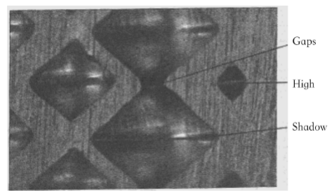
Figure 2-3 shadow, high and gaps
(3) Opening shape: The common opening shapes for the mesh cavities are square, rectangular and flat diamond. The shape of the opening is determined by the angle of the diamond carving knife, the horizontal feed speed of the carving head and the speed of the roller. Varying the speed of the roller and the horizontal feed rate of the engraving head will result in different cavity shapes. The shape of the cavity opening has a significant effect on the amount of ink transferred.
(4) Bottom shape: The common shapes of the bottom of the cavity are V-shaped and U-shaped. The U-shape is more rounded and smooth, which facilitates the transfer of ink; the V-shape is more prone to ink pile-up problems. As shown in Figure 2-4.

Fig. 2 – 4 the shape of the cell botom
(5) Depth of the cavity: The depth of the cavity is related to the width of the cavity opening and the angle of the carving knife. D= (W/2) × ctg (α/2) (2 – 1)
The small angle of the carving knife tends to create deeper cavities and is not conducive to ink transfer. The angles currently in use are 110°, 110°, 110° and 110°.
120°, 130°. In addition, the flattened cavities are deeper than the square cavities and elongated cavities, while the number of engraving lines and the angle of the engraving knife remain the same.
2.2.3 Gravure formation of cavities
The most common methods of corrosion are direct chemical etching and electrolytic etching with a mesh; and engraving, which is commonly used for electronic and laser engraving.
(1) Chemical corrosion method
The original is firstly processed through a colour separation machine to make a continuous film, then the photopolymer is applied to a copper cylinder and exposed to form the text and white areas. A representative method of etching cavities is the Bumelan method. The amount of exposure is controlled according to the depth of the original to create different shades of cavities.
(2) Electronic engraving method
The electronic engraving method is a high speed, fully automatic gravure cavity formation method where a diamond engraving knife is used to engrave directly onto the copper side of the gravure cylinder.
The original is then scanned in successive shades to obtain a light signal of different image densities depending on the size or shade of the screen. The light signal is converted into an electrical signal and, after processing, a variable current and digital signal is transmitted to control and drive the electrical engraving knife, which engraves on the surface of the copper cylinder to form gravure cavities of different shades and sizes.
2.2.4 Structure of the gravure cavity
(1) Comparison of reticulate structures
The chemical etching method creates a gravure mesh with a rounded bottom, which makes it easier to transfer the ink and to form a “bowl shape”.
The electro-engraving machine has only one structural variation of the cavity, the reverse cone cavity, which varies in size and depth. The electro-engraved gravure cavities are influenced by the angle of the diamond electro-engraving knife, resulting in incomplete release of the ink from the conical cavities, which affects the amount of ink transferred to the cavities. However, the electro-engraved cavities are highly efficient and flexible.
(2) Comparison of the amount of ink stored in the cavities [ 75] [76]
The amount of ink stored and transferred in the gravure cavities is determined by the cavity configuration and the number of cavities. Theoretical calculations of the ink storage capacity of the two types of cavities were carried out.
Erosion method Mesh cavity volume = W*D*L*V*H (2 – 2)
Electric engraving method Cavity volume = 1/3*W*D*L*V*H (2 – 3)
Where: W = web width; D = web depth; L = web length; V = number of vertical webs; H = number of horizontal webs
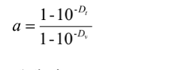
As can be seen from Equations 2-2 and 2-3, the ink transfer from the etched cavity is greater than that from the electro-engraved cavity. In the case of etched cavities, the opening is square in shape; in the case of engraved cavities, the cavities are conical in shape, and in the case of two cavities with the same surface and similar depth, the amount of ink stored in the electro-engraved cavities is approximately one third of the ink stored in the etched cavities. The electro-etching cavities are conical and the ink used in electro-etching gravure requires better colouring and flow. In general, a ratio of cavity width to depth of around 28% is appropriate. Assuming a ratio of cavity width to depth of K = h/a, the cavity opening and depth are halved when the number of lines is doubled, theoretical calculations ignore the presence of the mesh wall. It can be assumed that the entire anilox roll is combined into one anilox, and that the ink supply is halved due to the halving of the depth.
The high thread count conical cavities have a tapered angle, which prevents the ink from filling the inking holes and leads to clogging of the cavities, which can easily reduce the ink transfer and result in a significant shortage of ink supply. The use of tapered cavities is therefore not recommended in production practice. In practice, improved engraved cavities should be used.
(3) Comparison of printability
A. Comparison in terms of ink transfer
The cavity configuration of the etching method has a relatively wide opening and no dead space at the bottom, while the viscosity of the gravure printing ink is low, the flow is good, the ink transfer performance is good, the printing ink layer is thick, the colours are vivid and the text is clear. However, the etched cavities are not easy to control and have seam connections, and the repeatability is poor. They can be used to reproduce a small number of classic prints.
The electro-engraving method has a reverse cone shape and poor ink transfer. However, it is highly productive and can be used seamlessly, with an evenly spaced, richly layered mesh and good repeatability. It is also possible to flexibly change the angle of the drilling knife to achieve the characteristics of the etching cavity and to improve the printing performance of the electro-engraved gravure by means of some post-treatment methods, with ink transfer rates of up to 80%.
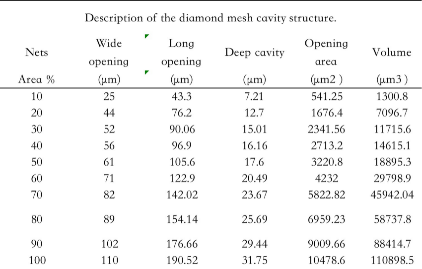
B. The four common types of cavities used in gravure engraving are square fine cavities, square coarse cavities, diamond-shaped cavities and flat diamond-shaped cavities. Common cavity parameters are shown in Table 2-1, Table 2-2, Table 2-3 and Table 2-4.
Table 2 – 1 the structure parameters of square cell
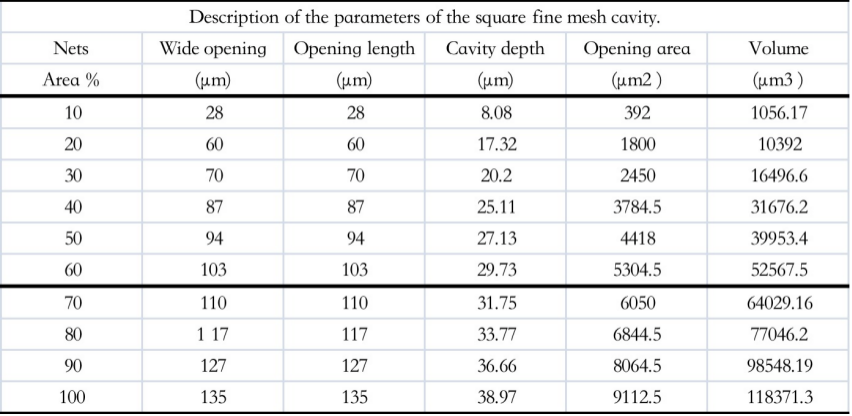
Table 2-2 the structure parameters of flattened di amond cell

Table 2-3 The structure parameters of rough square cell

Table 2 – 4 The structure parameters of rough diamond cell
C:Different mesh cavities in printing
In order to avoid “moiré” and to improve the sharpness of the graphic edges in gravure printing, in general: the parameters required for the different screen cavities vary. For the yellow version, a coarse 45° square mesh at 54 lines/cm is used; for the black version, a coarse/fine square mesh at 90 lines/cm is used; for the magenta version, a 60° flat diamond mesh at 70 lines/cm is used; and for the cyan version, a 30° diamond mesh at 70 lines/cm is used.
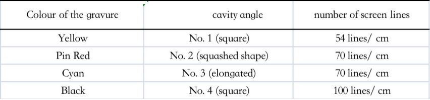
Table 2 – 5 The angle of cell and colou of plate
2.3 Rotogravure thermal transfer printing paper plate making Screen cavity study
2.3.1 Experiments
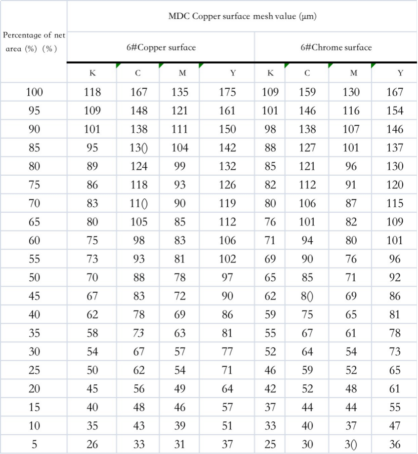
(1) Experimental apparatus: ROCELL-STAR-II cavity measuring instrument for the characterisation of cavities on gravure plates engraved with a German imported HELL and an electro-engraving machine MDC.
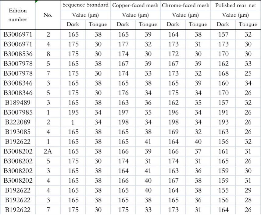
(2) Engraving data: Based on the theoretical analysis of cavities, a well-known gravure plate maker engraved a product in accordance with the theoretical basis of the previous analysis, and the engraving data are shown in Figures 2 – 6.
Table 2 – 6 Values for different mesh cavities
Tab. 2 -6 the different value of cell
The structure of the engraved cavity is shown in Fig. 2-5.

Fig. 2 – 5 T structure and size of cell on the copper
After engraving the cavities on the copper surface, the cavities for production need to be further polished, the structure of which is shown in Figure 2-6.
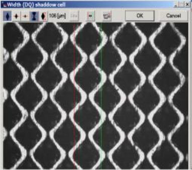
Fig. 2 -6 The structure and size of cell on the polished cycliner
(3) Data analysis
Table 2 – 6 Based on the findings of the analysis in 2.2, 16 plates were engraved in three stages for the thermal transfer printing paper. The engraving analysis was carried out for the standard cavities, the copper surface cavities, the polished cavities, the darker tones and the through gutters. As can be seen from Table 2-7: the copper surface dark tone mesh values are theoretically required to be equal to the standard mesh values. This is because the copper layer is the engraved graphic layer. Since gravure printing is a very stressful process and the copper layer is relatively soft, the engraving is followed by chromium plating, which is approximately twice as hard as copper and increases the plate’s resistance to printing. This is why it is important to pay attention to the thickness and uniformity of the coating when chrome plating. In general, a variation of 4µm to less than 5µm is normal after chromium polishing, and a thickness of around 1µm is appropriate. As can be seen from Table 2-7, the darkening of the neps is reduced by approximately 1µm after chrome plating. After chrome plating, the chrome surface is polished to deal with the sharpness of the mesh on the one hand and to avoid the plate being too mirror-like on the other. By polishing, the darker mesh values are reduced by around 8µm. The darker parts of the mesh have a value of around 155-170µm.
The chrome plating and polishing reduces the value of the mesh, which reduces the amount of ink transferred through the mesh. As can be seen from Table 2-7, the through-groove size is between 26 and 32µm.
2.3.2 Analysis of the selection of cavities for heat transfer printing
(1) Engraving
According to 2.3.1 the selected mesh cavities were engraved on a German MDC electronic engraving machine for thermal transfer printing paper according to the theory described above, and the mesh values for the three primary colours were polished.
(2) For engraved cavities Gravure proofing analysis
Using the cavity parameters described above, the digital gravure machine is used correctly in the gravure shop to produce a satisfactory proof.
1 ) Steps.
a. Arrange the rolls to be proofed in order of serial number in front of the proofing machine.
b. Turn on the power and turn on the mainframe computer.
c. Place plate roller No. 1 flat on the lifting table, open the lifting valve so that the centre of the plug hole is aligned with the top, open the top valve on the tailstock, jack the plate roller in and then drop the table.
d. Depending on the length of the plate roller, click on the tailstock to open it and adjust the plate roller to the centre of the squeegee, both sides being equal.
e. Enter the circumference of the plate roller, the proofing speed 20 – 30 m/min (twice the actual speed), the proofing pressure (3 KPa), the plate roller pressure (3 KPa) and the proofing angle at the standard 45° as indicated in the file.
f. Rotate the roller, align the positioning tip with the positioning slot on the roller and click on “Position out” so that the tip enters the positioning slot of the roller and the roller no longer shakes.
g. The distance between the plate roller and the rubber roller is already adjusted by the computer when the circumference of the plate roller is entered, click on the sample drum to move forward and check the distance between the plate roller and the sample roller.
h. Select the desired substrate, lay it flat on the roller and tighten the substrate. i. Proofing.
a) Cleaning the layout: click to wash the plate, clutch open, and clean the rollers once with thin material.
b) Pressing: Position the rollers, click on the positioning extension, click on the sample drum to move forward, click on the proofing, clutch
Open the rollers so that they start to rotate and fit the substrate closely to the rollers, and then put the rollers back in place again.
c) Cleaning of the plate rollers: click on the positioning to reach out and fix the rubber rollers, click on wash, clutch open, make the plate rollers rotate, clean the plate rollers, click on stop rotation after cleaning.
d) Squeegee positioning: click on Auto Control, click on Squeegee Up to return the squeegee to its starting position, click on Squeegee Down to stop the squeegee in front of the plate roller.
e) Mark line adjustment: Click on the lower frame and, once the frame is positioned, adjust the mark line so that the “+” on the plate roller coincides with the “+” on the monitor screen and the dot on the plate roller can be seen clearly.
f) Sleeving: first place the marker in the same position, then start sleeving the plate from the bottom up.
g) Proofing: Click on proofing, clutch on, so that the plate roller turns once along the rubber roller, after proofing, first return the rubber roller to its position and then click on the squeegee to rise.
h) Cleaning the plate rollers: clean the ink from the plate rollers and squeegees, then click on wash, clutch open, clean the plate rollers and squeegees, click on stop rotation, open the lifting frame and remove the plate rollers.
2) Repeat the above for multi-colour plates. The density of gravure proofing is shown in Table 2-7
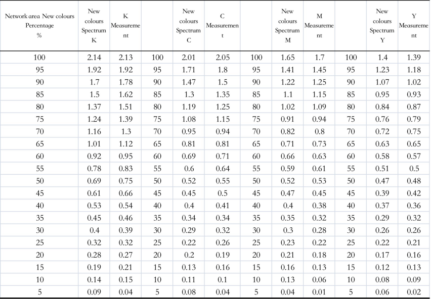
Table 2 -7 The proof density of gravure


Figure 2-7 C The relationship between the density of C and dot percent

Figure 2-8 M The relationship between the density of M and dot percent
Figure 2 -9 he relationship between the density of M and dot percent
Table 2 – 8 Concave proofs Field standards Density

Tab. 2 – 8 the standard density of gravure
After proofing, the final density of the print met the requirements of the national standard, indicating that the shape and angle of the cavities were chosen and that the mesh values were appropriate for the light, mid and dark areas. In order to express the values of the various layers and colours more clearly, the copper side of the printing plate was tested, as shown in Table 2-9. This can be used as a reference for transfer printing paper engraving.
Table 2 -9 the cell value of copper
2.3.3 Analysis of experimental data
This is because in gravure printing the layers are represented by changing the depth of the mesh, the shape of the opening and the area, so that the print appears as a continuous tone of layers, but not as a real dot, which is a similar problem in digital printing, for example.
Or the Euler Neilson formula

The density was converted to a percentage of dot area for analysis. The field densities of the gravure proofs generally accepted by the gravure industry are shown in Table 2 – 9 and according to the analysis in Figures 2 – 7, 2 – 8 and 2 – 9 it can be seen that the field densities of the three primary colours correspond to 1.4 for Y, 1.65 for M and 2.0 for C, which are fully in line with industry standards. This means that the mesh cavities obtained from the above analysis are perfectly suited to the quality requirements of transfer printing, and can be used as a reference for the selection of mesh cavities for gravure engraving in the transfer printing industry.
2.4 Summary of this chapter
This chapter optimises the selection of the screen cavities according to the usual requirements for the quality of gravure transfer printing. For heat transfer gravure printing, in electronic engraving gravure plates: the light side of the copper side of the engraved text has a mesh value of around 30 to 42 µm; the dark side has a mesh value of around 155 to 170 µm. The darker tones of the print require more ink transfer through the cavities, which is reduced by the chrome plating and polishing.
The number of wires and mesh angles commonly used are: 38° for open crimped mesh, 38° for open crimped mesh and 38° for open crimped mesh.60° for elongated cavities, 45° for yellow plates with low wire counts, 45° for higher wire counts for black plates, 38° is used. In gravure printing, to improve the clarity of the edges of the text, the number of wires used for the black plate is 90 L/cm and the cavity angle is 38°; the number of wires used for the magenta plate is 70 L/cm and the cavity angle is 60°; the number of wires used for the cyan plate is 70 L/cm and the cavity angle is 30°, and the number of wires used for the yellow plate is 60 L/cm and the cavity angle is 45°.
3. High-temperature heat-transfer based printing paper colour separation Electroengraving curve study
3.1 Introduction
3.1.1 Background of the study
With the diversification of the textile industry and the demand for a greener environment, the printing of thermal transfer printing paper is also developing rapidly. The application of gravure printing to transfer printing is an emerging process in recent years, so the printing parameters of the gravure printing process, especially the linearisation parameters of the colour separation plate, are currently mainly done with reference to the traditional gravure printing method, which produces products with a low level of colour vibrancy and a lack of colour levels. This is why it is important to analyse the linearisation process and the mechanism of the separation plate [81] in the transfer printing process in order to improve the printing quality of transfer paper and the reproducibility of textile colours.
3.1.2 Study content of this chapter
In gravure printing, the colour separation curve [ 82] [ 83] [ 84] is the most important parameter in determining the colour of the final printed paper and textile. On the basis of the conventional gravure printing electro-engraving curves, a suitable electro-engraving curve [ 85 ] [ 86 ] [ 87 ] for heat transfer printing is established by setting the number of engraving lines, the shape of the engraving cavities and the angle of the engraving, based on the characteristics of the heat transfer printing product, and the digital sample to show the effect.
3.2 Study of the mechanism of the electroengraving curve for colour separation plate making
3.2.1 Principle of ash balance
Grey balance refers to the different shades of grey from highlights to darks in a print by means of the right ink ratio
Colour. Grey balance [88] [89] [90] is the basic measure of the quality of colour reproduction in printing and is a guideline to be followed and implemented throughout the process of plate making and printing. Grey balance is the best way to judge whether the colour of a print is balanced or skewed. The basic rules of grey balance must be strictly adhered to during the adjustment of the electro-engraving level curve. The grey balance of a gravure proof is based on a digital proof of a gravure print. This is why it is important to first work out the grey balance data from the digital proofs in gravure, and then to create a grey balance curve for the gravure proofs.
(1) Silver-free grey ladder method
A 21-step silver-free grey scale is scanned under normal scanning conditions, after which the standard conditions are set for sampling. The grey scales are not off-coloured, but if they are off-coloured, they must be corrected during colour separation. The scanned grey scales are then colour-separated for the computer and the colour-separation data is corrected.The effect of ambient light, ambient colour and the observer on colour reproduction for digital and gravure proofing.
(2) Chromatography
In theory, a neutral grey can be obtained by mixing yellow, magenta and cyan in the same proportions, but in practice, due to the influence of printing materials and equipment, a combination of yellow, magenta and cyan with different dot percentages is used for proofing to find the grey blocks in them. The dot ratios of yellow, magenta and cyan have to be varied within a certain range to form a neutral grey, so empirical data has to be recorded in production practice to obtain a neutral grey balance. The following grey balance blocks can be used as reference blocks when setting up the gravure electronic engraving curve.
Table 3 – 1 Grey balance colour blocks
Tab.3 – 1 the colour patch of grey balance

(3) Photoshop software method
According to the theory of chromatic additivity, the three primary colours, red, green and blue, are mixed in equal proportions to give a neutral grey colour. Use Photoshop’s RGB additive mode to match the grey balance values. The RGB is then converted to CMYK subtractive mode by matching the R, G and B colours to obtain a neutral grey point, where the C, M, Y and K values are read.
3.2.2 Ash balance equation
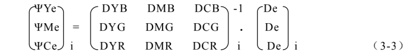
Firstly, assuming that density summation holds, the density of a three-colour ink overlay is equal to the sum of the densities of the individual colours. The density of neutral grey can be obtained by overprinting the three inks in a certain proportion in the printing process to obtain a neutral grey block. The density of the yellow, magenta and cyan colours is obtained from the grey balance equation [ 91 ] [ 92 ]. Under normal printing conditions, after the formation of neutral grey, the proportion of each colour of neutral grey ink can be found. Since the ink is made up of pigments and other components, the ink cannot be 100% pure and therefore has a printing side density. Therefore, when evaluating and characterising neutral grey, it is necessary to consider the primary density of each monochrome as well as the secondary density, so that the density equations for the red, green and blue filters are as follows.
ΨYeDYB + ΨMeDMB + ΨCeDcB =DeB
ΨYeDYG + ΨMeDMG + ΨCeDCG = DeG
ΨYeDYR + ΨMeDMR + ΨCeDCR= DeR (3 – 1)
From the filters: DYB, DMB, DcB, DeB – a blue filter for each colour and neutral grey density values
DYG, DMG, DCG, DeG – each colour and neutral grey density values measured under green filters
DYR, DMR, DCR, DeR – red filters for each colour and neutral grey density values
ΨYe, ΨMe, ΨCe – the proportionality coefficients for each colour of yellow, magenta and cyan ink when forming a neutral grey balance density.
Eq. 3 – 1 is called the grey balance equation, i.e. the neutral grey density value resulting from the overprinting of each ink colour is equal to the sum of the densities of the same filter at the right amount of each single colour ink.
Since the relationship between the secondary density and the primary density of each colour ink is non-linear, the calculation of the grey balance density should be carried out on a graded scale. For ease of calculation, equation (3 – 1) can be written as a matrix equation as follows
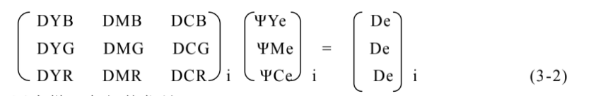
Where: i – code for each level of the grid point ladder.
DYB , DMB , …… DcB – are called coefficient matrices and the values can be tested.
De Neutral grey density, which should be DeB= DeG= DeR= De
Therefore, in equation (3-2), only ΨYe, ΨMe and ΨCe are the scale coefficients to be found, while all other quantities are known. Using the inverse matrix method, ΨYe, ΨMe and ΨCe can be calculated
Once (ΨYe)i, (ΨMe)i and (ΨCe)i have been found, they can be multiplied by the main density of the corresponding gradient to obtain the density values for the appropriate amount of yellow, magenta and cyan inks required to form a neutral grey density.
The grey balance equation essentially explores the relationship between dot area and density between the three primary colours of a thermal transfer print.
3.2.3 Study of the grey balance curve of thermal transfer printing paper
The data in Table 2-9 can be converted from density to dot area ratio using either the Murray-Davis formula or the Yul-Nielsen formula. The plate maker can correct the n-value to suit their own needs. In this way, the dot gain curves for each of the yellow, magenta and cyan plates can be found.
(1) Experimental material and procedure: The samples of gravure cavities and gravure proofs determined in accordance with 2.3 were used as samples for the grey balance study.
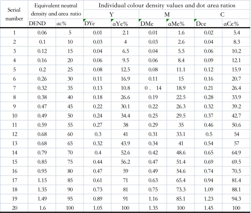
(2) Transform the data in Table 2 – 9 according to (2 – 4), (2 – 5) according to 3.2.1 Grey Balance Equation as shown in Table 3 – 2.
Table 3 – 2 xThe value of END and dot percent
(3) Plot the density curves for Y, M and C inks and equivalent neutral greys according to Table 3-2, as follows
This is shown in Figure 3 – 1.
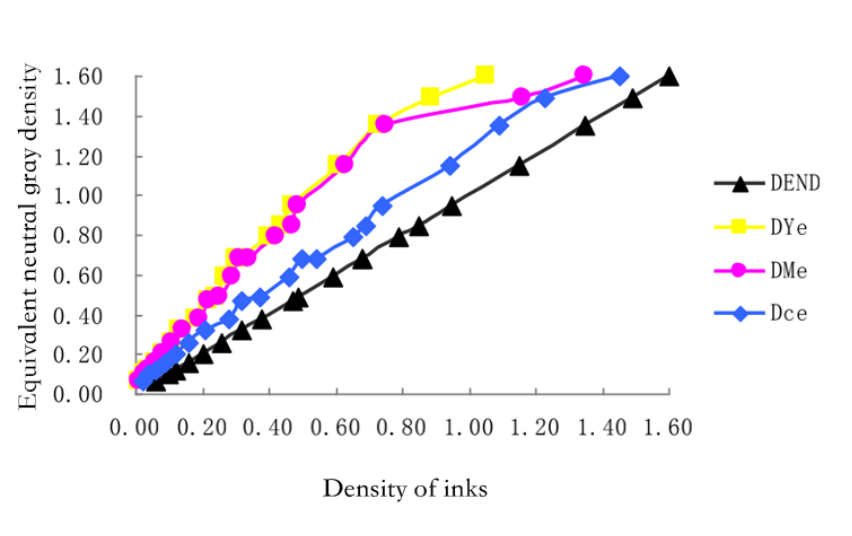
Figure 3 – 1 Tthe relationship between density of Y,M,C and END
Plotting of Y, M and C ink dots as a percentage of area and equivalent neutral grey dots according to Table 3 – 2
The area percentage curve is shown in Figure 3-2.
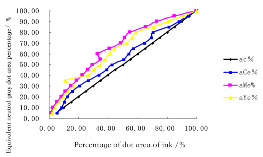
Fig. 3-2 the relationship between density of Y,M,C and END
By adjusting the CMYK colour density curves, the grey balance is brought to or close to the reference standard. The data in Table 3-2, Figure 3-1 and Figure 3-2 are used as the curves for the grey balance adjustment. Engrave the test chart, visually measure the difference with the reference standard and fine tune the engraving curve.
3.2.4 Gravure Density Curves
The density curves for gravure proofs have been plotted in Chapter 2 and are shown in Figures 2 – 9, 2 – 10 and 2 – 11. This is used to plot the relationship between the dot percentage and the density of a gravure proof. The density values in the field vary from one colour plate to another under different process conditions. For engraving at 70 lines/inch, the field density is around 1.5 for the yellow plate and 1.5 for the magenta plate. The field density of the yellow plate is around 1.5, the magenta plate around 1.8 and the cyan plate around 1.5. The field density is around 1.5 for the yellow plate, 1.8 for the magenta plate, 1.9 for the cyan plate and 2.0 for the black plate. The black plate is around 2.1.
3.2.5 Adjustment of the gravure level curve
In general, the highlight calibration is 0.15 to 0.30; with a low highlight calibration [93], it is easy to lose more highlights and less intermediate levels; with a high highlight calibration, the highlights are represented, but the overall tone of the image is flattened.
(1) High light calibrations
For high-end transfer prints, the highlights are generally heavier for the four colour versions. The highlight test engraving value is dark
The engraving of the gravure is better when the engraving value is adjusted by l/4.
(2) Darkening calibration values
The general level of the draft dark tone calibration is 8.5 to 9.0. The dark tone calibration value is low, the dark tone part of the network becomes shallower and narrower, the corresponding density of the ink layer of the sheet becomes smaller, the dark tone level is clear. The dark tone calibration value is very important for the performance of the dark tone level. The larger the dark tone calibration value, the larger and deeper the dark tone nets obtained in the engraving, the more ink storage, the more ink transfer in the printing, the thicker the ink layer thickness of the dark tone area on the print, the greater the reflection density.
(3) Network cable angle
The angle of the stencil also has an effect on the level curve of the engraving. The angle of the stencil is the angle between the line passing through the maximum width of the horizontal stencil and the line passing through the centres of the two closest stencils (acute angle). The mesh angle and the corresponding angle of each colour plate are designed according to the conclusions of 2.2.4.
(4) Printed materials
The most commonly used paper for transfer printing is the 50g/m2 newsprint and kraft paper with a rough surface, many microscopic pits, strong ink absorption, a thin layer of ink left on the surface of the paper during printing, a low reflective density and a lighter colour of the printed product. Generally the darker part of the calibration value or test carving value increased by 5% to l0%.
3.3 Acquisition of electro-engraved colour separation curves
3.3.1 Preparation
(1) Standard test plate [94][95] rolls set: test plate rolls specification: large plate, not less than 1070mm*600mm; small plate, not less than 800mm*550mm
(2) Test inks: the printer is responsible for providing their identified ink manufacturer, brand, type and number
About 5KG each of the same ink.
(3) Ink quality testing equipment: one No. 3 Charn cup, one pack of plastic droppers, one 50 ml measuring cylinder; 20 50 ml beakers; three 800 – 1000 ml beakers, one balance with an accuracy of 0.1 g, one ink spreader; one stopwatch; two temperature and humidity meters; one spectrophotometer 939; one standard light source; 100 m of printed substrate for customer testing.
(4) Measuring equipment and instruments: 939 spectrophotometer (can be shared with the ink incoming inspection, can measure density, chromaticity and colour difference); electric engraving and chrome plating after the mesh measuring instrument; Eye/one measuring platform.
(5) A quality and stable scanner and calibration card, Eizo display (EIZOCG222W or EIZOCG301W), digital proofer and stable paper and ink (to be tested).
(6) Observation equipment: standard light source (D50), large and small.
(7) GMG or EFI XF digital proofing software (recommended version 3.1 or above).
(8) Choose a reference standard for testing the effect of the plate (commonly European, American, Japanese offset standards or laboratory supplied reference standards).
3.3.2 Implementation steps.
(1) Linearisation of the electric engraving machine: the parameters are assigned according to the results of the linearisation in 3.2 above, and the selected electric engraving machine is selected, tested and adjusted so that the linearity of the machine is normal and close to the same.
(2) Determine the type of engraving machine, the engraving head and the engraving knife (manufacturer and length of shank) to be tested and calibrate the reticle.
(3) Test linearity: Standard linearity test drawings are provided by the laboratory, loaded with the specified electro-engraving C, M two curves and choose the corresponding mesh wire mesh angle on all equipment of the same model for the ladder scale engraving, after engraving for each colour block of the dot to measure and fill in the results carefully in the “electro-engraving linearity test record sheet”. In which each electric engraving machine engraves three times, using the same needle when engraving; in order to reduce measurement errors, it is best to have the same person carry out the measurement when testing and adjusting the linearity of the electric engraving machine.
(4) An analysis based on the “Electroengraving Linearization Test Record Form” , selecting the electroengraving machine with stable linearity and at an average value as the standard equipment for creating electroengraving curves.
(5) Adjusting the linearity of other equipment that deviates from the standard equipment to bring it closer to the standard equipment. (In general linearisation can be done by setting different mid-range values for different devices or by adjusting the parameters of the device, while stability is done by the device manufacturer).
3.3.3 Creating an engraving machine curve
Optimisation of the electric engraving process curve so that the process is free of obvious defects and the process is close to the same for all models.
(1) Preparation: Adjustment based on the reference curve provided by the manufacturer
(2) Determining highlights and darks: Set the values as set in 3.2. The dot where the transfer can be started determines the highlight value and the ink density in the field determines the dark value. If the dark tone value is sufficiently large and still does not achieve the desired real ink density, then the dark tone value is determined.
To determine the field density, the ink may be adjusted or the reference target value may be modified [ 96 ] [ 97 ] [ 98 ], taking into account the printing contrast; after obtaining the optimum field density, the theoretical optimum density at each level of the 21-step scale is calculated. Determination of the electroengraver curve: Determination of the standard web values, curve data.
(3) Single-colour graduation scale.
The net values for each level of the 21-step scale are determined by referring to the theoretical density of the scale based on the density of the scale and the net values from step 3.3.3 (2). The net values are then optimised by cyclically sculpting the scale so that the density of each level is close to the theoretical optimum density.
3.4 Verification of electrical engraving curves
3.4.1 Test version of the design criteria
According to the national standards GB/T 21301 -2007 and GB/T 18721 -2002, the data testing part of the printing test plate is composed of measuring strips, of which there are many types, and according to the production requirements of the company, a single colour field block of Cyan (C), Magenta (M), Yellow (Y) and Black (K) was selected as the data testing part of the test plate. (In this project, a monochromatic field block in Cyan (C), Magenta (M), Yellow (Y) and Black (K) and a four-colour scale in Cyan (C), Magenta (M), Yellow (Y) and Black (K) were selected as the data test part of the test plate. For the visual test, representative standard images were selected as shown in Figure 3-3.
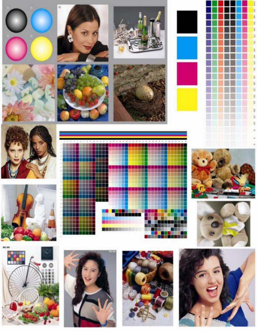
Figure 3-3 Printing standard test plate of heat transfer printing
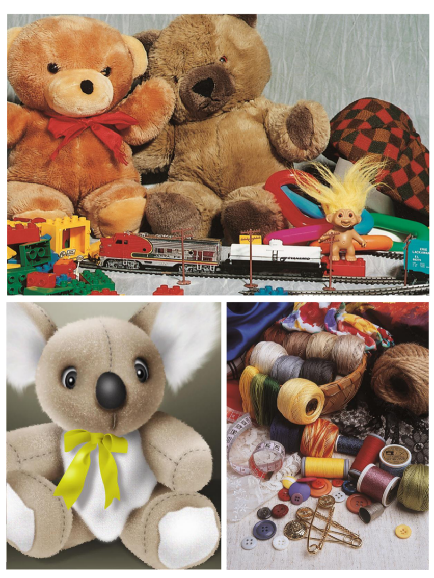
Figure 3-4Printing standard test plate of heat transfer printing
Figure 3 – 5 Printing standard test plate of heat transfer printing
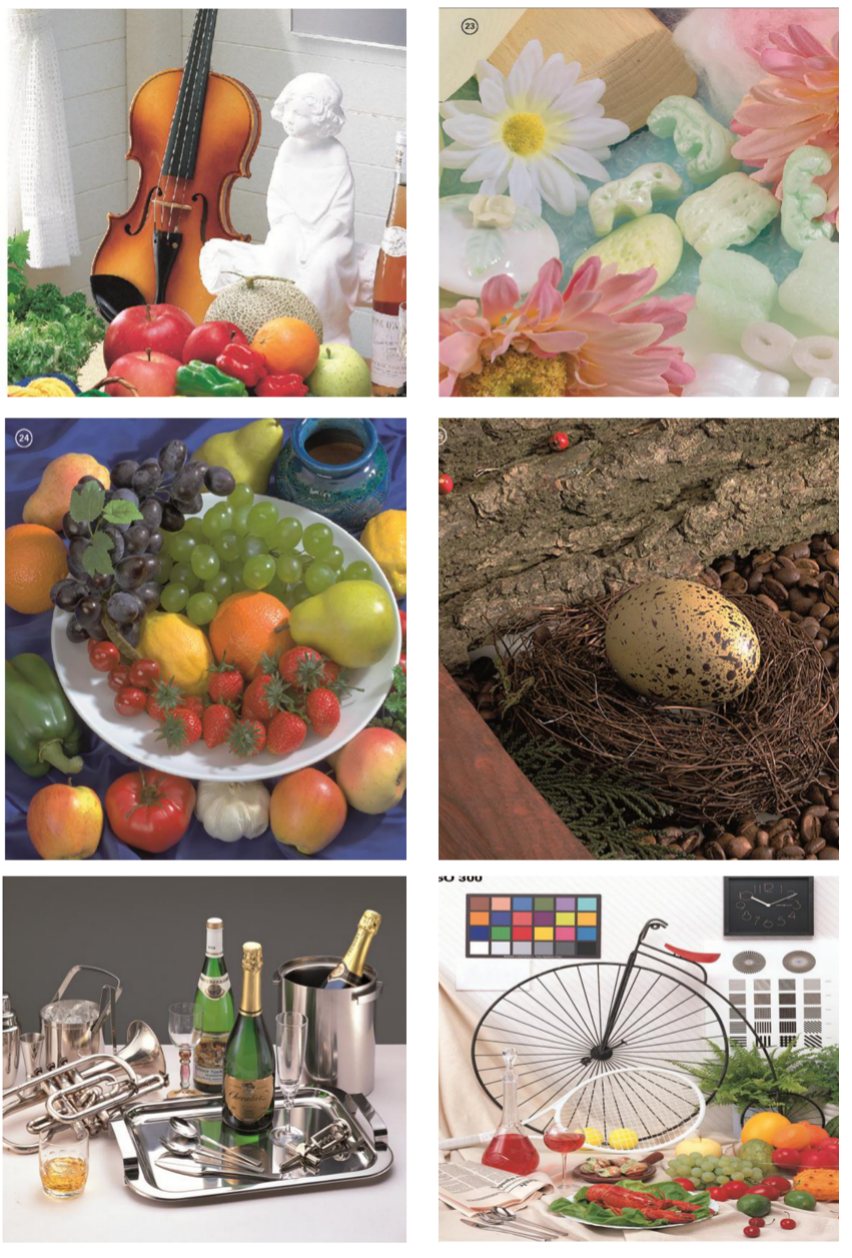
Figure 3-6 Printing standard test plate of heat transfer printing
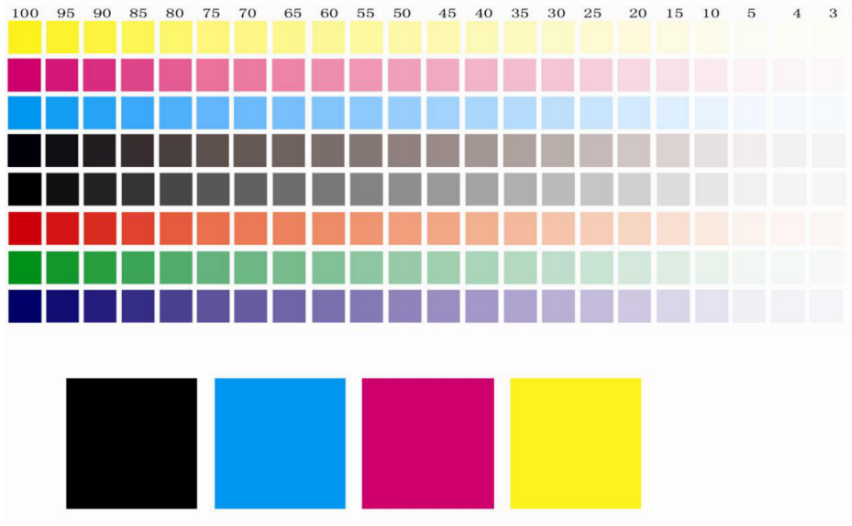
Fig.3-7 the solid and ladder of YMCK
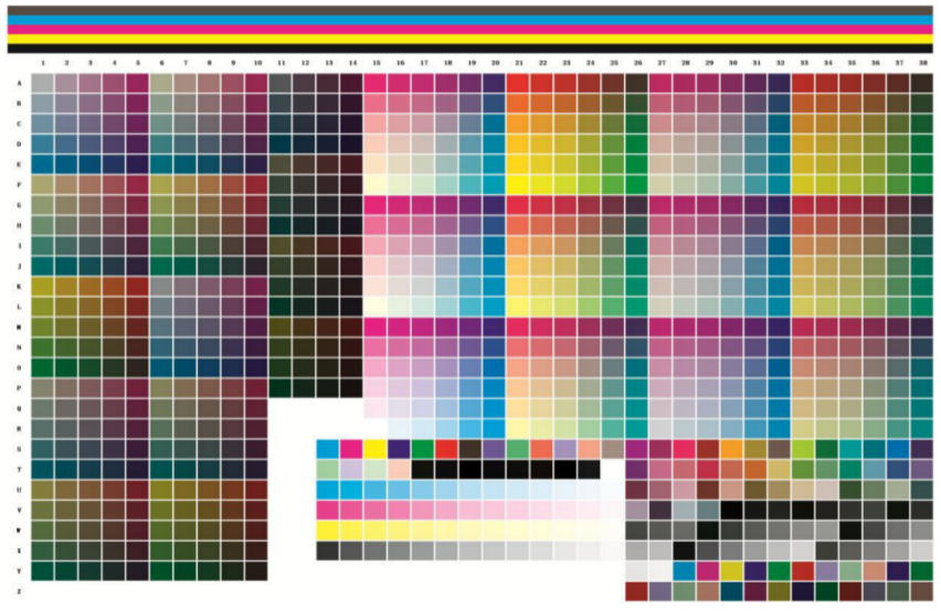
Fig. 3-8standard colour target
The images selected for the visual test section served two purposes, the first was to evaluate the accuracy of the gravure engraving curve settings and to visually inspect the reproduction of the layers in several images according to the national standard GB/T 21301 – 2007. The second function is to examine the colour reproduction of the image. Figure 3-4 Still Life Bear Colour and shade, mainly examining the colour transition light colour reproduction; Figure still life textile line mainly reflecting the various spot colours in transfer printing. Figure 3-5: Bird’s egg on dark background, looking at the grey balance of the background colour in the darker areas, Figure 3-5: Fruits and vegetables, looking at the reproduction of the lighter shades, with white, yellow, red, green and blue-violet as the main colours; wine and cutlery, looking at the metallic and glass lustre and its transparency; the grey balance of the grey background, and the reflection of the glass on the table. The grey balance of the background, the reflection of the glass on the table, etc., are used to examine the darker parts of the reproduction and the gradation of the tones. Figure 3-6 Portraits examine the reproduction of the grey balance on the grey backgrounds of people’s skin tones and clothes from different countries. Figure 3-7 provides a standard Y, M, C, K field block with a four-colour grid point scale and a standard IT colour target chart to provide test points for experimental data. The analysis of the electro-transfer curve is carried out in two ways, one is to engrave a test plate of the gravure, and the other is to print a direct digital sample, first digitally, to check that the colour separation electro-engraving curve is reasonable before engraving. So the following experiment is divided into two parts.
3.4.2 Digital proofing
(1) Purpose
The digital proofing set-up and maintenance workflow is standardised so that the operator can achieve the same results by following this workflow. It also provides the customer with a sample for reference. Suitable for EFI
4.0 Digital Proofing Software Workflow Setup and maintenance.
(2) Digital proofing experimental process
1) Preparation.
a. Standard gravure colour characteristics file for digital proofing simulation.
b. Check that the printer is in good condition by printing a test pattern on the printhead. c. Check that the correct consumables are being used.
2) Printer linearisation and overview document
(EFI Colorproof XF 4.0 as an example)
a. Workflow setup
a) Setting up the linearisation device: Set the printer model and the print port, with the default parameters in the print media and without selecting any paper overview parameters. As shown in figures 3-9 and 3-10.

Figure 3 -9 setting up the type of printer Figure 3 – 10 setting up the printed medium
b) Connect the linearisation workflow EFI Linearization with the linearisation device as shown in Figure 3 – 11. Note that the colour management is switched off.

Fig. 3 – 11 Linearized equipment
c) Connect the measuring instruments.
b Linearisation
a) Open the EFI Colour Management Tool and select Create Base Linearisation. This is shown in Figure 3-12.

Fig.3 – 12 creat linearization
b) Set the measurement device, printer settings, print media settings, output settings and linearisation preferences. For the print media type in the print media, select a paper type close to the print media and enter the name of the actual paper to be used in the print media. The print resolution is usually 720×720 and the list of available print modes and colour modes varies between printers and can be set as shown in Figure 3-13. The printing direction is usually unidirectional. The linearisation intention is selected as proof.

Fig.3 – 13 set up parameters of printer
c) Determine the ink limit for each channel, first spot print and allow to dry sufficiently before measuring. After measurement,The advanced buttons below adjust the ink limits . A print reference overview file can be entered as a reference. This is shown in Figure 3 – 14.

Figure 3 – 14 set up values of ink
d) Linearisation, first spot print, then allow to dry and measure. The mid-tone increase of the linearisation can be adjusted via the advanced options (after linearisation, this can be adjusted here if the visual inspection is not satisfactory). This is shown in Figure 3-15.
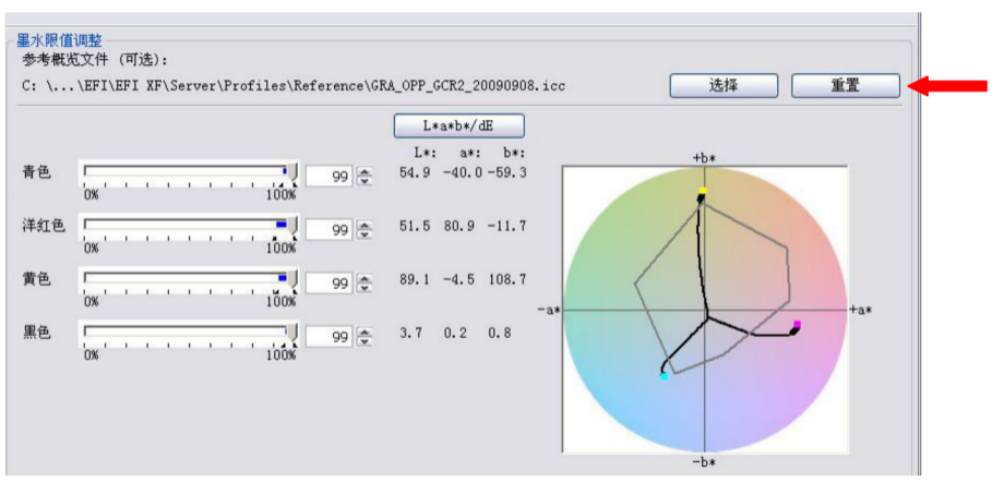
Figure 3 – 15 Effect drawing after linearization

Figure 3 – 16 reset up values of ink
e) Determine the total ink limit by spot printing and allow to dry sufficiently before measuring. This is shown in Figure 3-16. The total ink quantity can be determined in three ways: by measurement, by visual inspection or by numerical definition (it is recommended to use a combination of measurement and visual inspection, usually with an appropriate increase in the measurement, and to choose as large a total ink quantity as possible). This is shown in Figure 3 – 17.
Figure 3 – 17 Increasing the total ink volume for printing
Fig.3 – 17 the effect printing after total values of ink
f) Quality control by spot printing and measuring after sufficient drying. At the same time, the monochrome and grey scales were checked visually. This is illustrated in Figure 3-17.
Figure 3 – 18 creat linearization report
g) Linearisation report, after the measurement has been completed, you can create a report by tapping on it to create a linearisation report as shown in Figure 3 – 18. In this report, the focus is on two issues: firstly, whether the paper gamut encompasses the printed gamut (the most saturated colours). If the linearisation curve generated is not smooth, the printer is in poor condition or the measurement is incorrect, so it is advisable to do it again to confirm that the results are correct. The linearisation report is shown in Figure 3-19.
c Create a printer media overview document
a) Start creating the print media overview file, after completing the linearity you will be prompted “Do you want to create the print media overview file immediately”, click Yes to enter the Create Print Media Overview File screen. This is shown in Figure 3-20.
Figure 3 – 19 linearization report

Figure 3 -20 creat profiles of printed medium
b) Settings: Select a measurement colour chart that is as close as possible to the colour chart used to generate the reference overview file. See Figure 3-21.
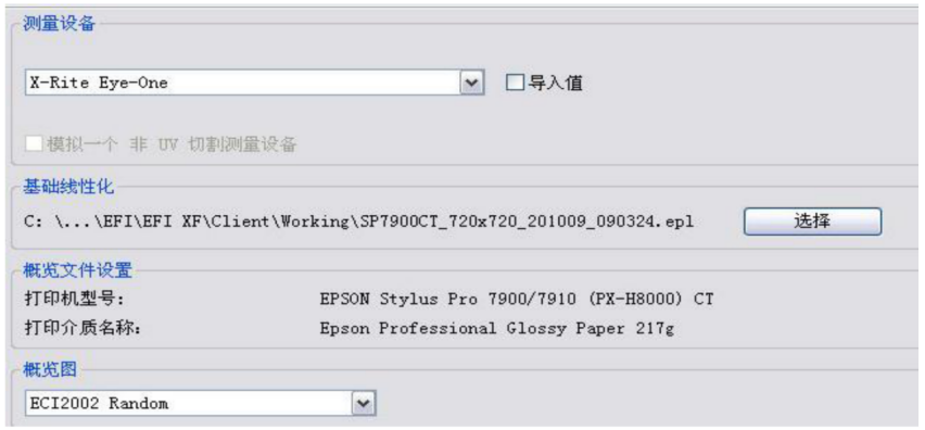
Fig. 3 -21 Selecting a measurement colour chart
Fig.3 -21 select color charts
c) Measure and create the print media overview file: first spot print and allow to dry sufficiently before measuring. If you are using Eye one for handheld measurements, prevent serial or misaligned measurements during the measurement process and make sure that the first and last colour block in each row is correct. When the measurement is complete, tap Create Now, enter the name and the software will calculate it automatically. When the calculation is complete, the point is finished. This is shown in Figure 3-22.

Figure 3 -22 profiles of printed medium
3) Setting up the workflow
a Create an output device: Create a new device under Output devices, select Print port in Settings and select the print media overview file created in the previous step. Then save the result. This is shown in Figure 3-23.

Figure 3 -23 Creat output device
b Create a workflow: Create a new process under Workflow and set up the target reference overview file in the colour management panel. Load the target reference overview file in the position indicated by the red arrow on the right side of Figure 3-24.

Figure 3 -24 loading target profiles
c Connect the workflow process, linking the user, the workflow and the output device. A complete digital proofing workflow is thus created. If required, edit the white point in the target reference overview file.
Enables analogue base colours to be printed more closely.
4) Optimisation of the overview document
a Start optimising the overview file: Open the EFI Colour Management Tool and select Optimise Overview File. This is shown in Figure 3-25.
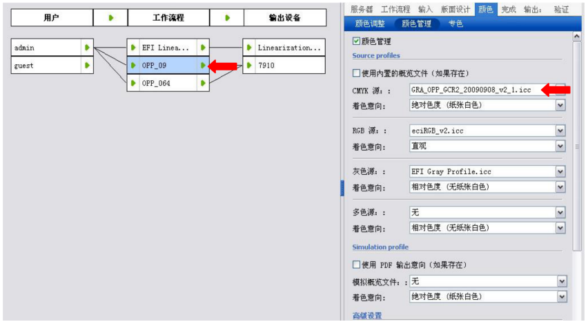
Figure 3 -25Optimized profiles
b Settings: Select the measurement device, the workflow to be optimised and optimise the diagram as closely as possible to the previous one. In the Optimisation method select “Create new L*a*b* calibration overview file”. This is shown in Figure 3-26.
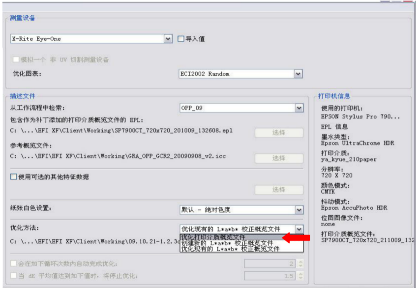
Figure 3 -26 Creating a new L*a*b* calibration overview file
Fig.3 -26 creat new corrected profiles of L*a*b*
c Stamp and optimise: first tap Stamp and allow to dry sufficiently before measuring. After measuring, tap “Optimise and Print” and measure again. This can normally be repeated three to four times , cycling until dE ≦ 1.5. As shown in Figure 3-27.

Figure 3 – 27Many times of optimization and printing flowcharts
d Complete the optimisation: Once the optimisation has reached its intended target, select one of the identified optimisations and click “Finish”. The software will prompt a confirmation message. This is shown in Figure 3-28.

Figure 3 -28 product the optimized profiles
e Apply optimisation: Once the optimisation results have been saved, select the optimisation file saved in the previous step in the Lab Optimisation option under the Colour panel of the workflow. This is shown in Figure 3-29.
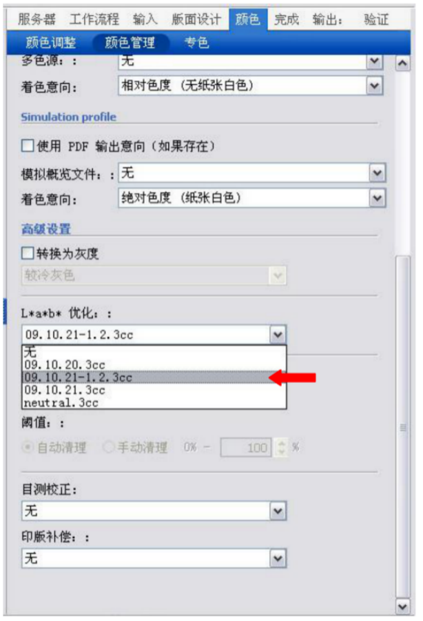
Figure 3 -29 saving the optimized profiles
5) Visual correction
If, after the previous optimisation step, the visual measurement test is still felt to need improvement, a visual correction can be selected.
a Open the EFI Colour Management Tool and select Visual Re-Linearisation. As shown in Figure 3-30.

Figure 3 -30 a new linearization
b Edit the curve according to the visual evaluation (if the curve for a single colour is edited first, the curve for the overall colour cannot be edited, if M is edited, CMYK, CMY, multi-colour cannot be edited). As shown in Figure 3 – 31
Shown.

Figure 3-31 editing the single linearized curve
c Store the curve, tap OK, enter the file name in the Save window and save the curve in the default position.
The software will automatically transfer the saved curves to the server. This is shown in Figure 3-32.

Fig. 3-32saving the linearized curve
d After applying the curve and saving the visual calibration results, select the vcc file saved in the previous step in the “Visual Calibration” option under the colour panel of the workflow. This is shown in Figure 3 – 33.
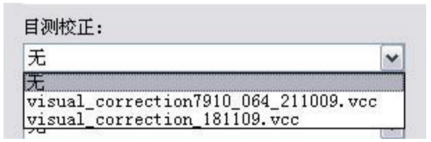
Figure 3-33 visual measurement curve
6) Digital proofing process validation and maintenance
The digital proofing process can be verified by three methods.
a Overview file optimisation: see 3.4. The overview file optimisation function allows you to check the current proofing of the code, which is measured in the ECI2002 table and has a more accurate result in terms of data.
b Visual verification: The reproduction is judged by visually comparing the colour difference between the current sample and the standard sample under standard light conditions. This method should normally be carried out in conjunction with the comparison of data.
c Control strip validation: to determine digital proof restoration by measuring and comparing the current proof with the original digital proof standard or the original print standard. The tool used to measure and compare the control bar is the Measure Tool of Profile Maker (see tutorial on using Profile Maker). The control bar can be used with the Ugra control bar as shown in Figure 3-34. It is recommended that an average ∆E of < 1.0 is used as a guideline.

Figure 3 -34 control strip of Ugra
(3) Test Results and Discussion
1) Density in the field
The field density is the reflectance density of the cyan (C), magenta (M), yellow (Y) and black (K) colours at 100% of the reticle area. The X-rite528 spectrodensitometer is used to measure and record the reflectance density of the colour blocks at each grid point in the trapezoidal scale and to compare it with the density values specified in the national standard. Table 3-3 shows the range of field density values specified in the national standard GB/T 21301 -2007.
Table 3 – 3 the solid density of gravure proofs

The field densities of the digital samples tested after conversion to linear according to (2-4) and (2-5) are shown in Table 3-4.
Tab.3 -4 the full colour solid density of digital proofs
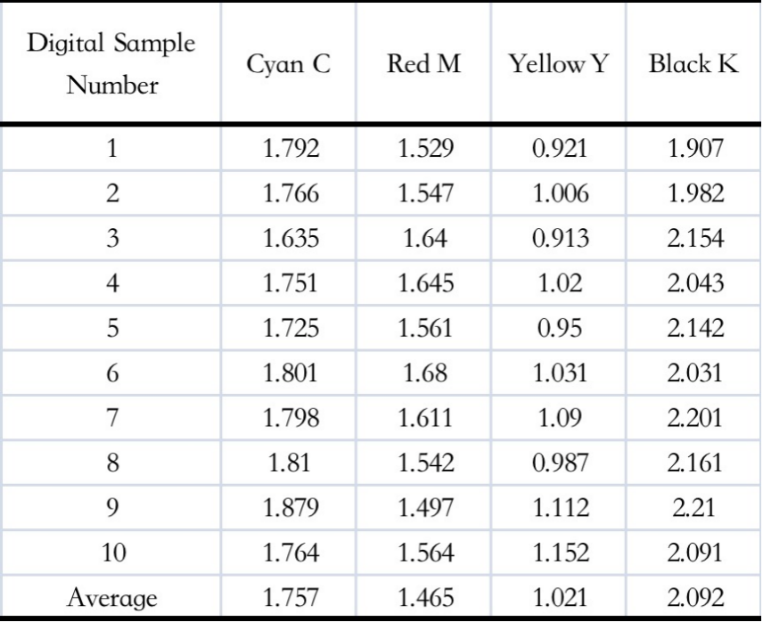
As can be seen from Tables 3-4, the average field density values of the digital proofs compared to those of the gravure proofs are generally within the range of industry accepted standards and, in terms of values, are somewhat small, as the main substrate in the gravure industry is plastic film. Here, data from offset and gravure digital proofs are analysed to show that the linearisation of the colour separation plate meets the production requirements.
2) Printing relative contrasts
Print contrast [101] (K value) is the contrast between field density and dark density (mainly 75% or 80% density). The higher the print contrast value the more layers it can reproduce and the richer the detail of the darker tones; conversely, the lower the print contrast value, the fewer layers it can reproduce (see Table 3-5). The formula is.
K = (Ds – Dt)/Ds =1 – Dt /Ds (3 – 4)
Ds is the field density value, Dt is the 75% or 80% density value, we generally use the 75% density value, the four-colour print contrast is generally controlled as follows
C, M, K : 35% -45% Y : 28%-35%
Table 3 – 5 the meaning of different solid and contrast

The density values for the corresponding points of the test specimens and the values of the relative print contrast calculated according to equations (3 – 4) are shown in Table 3 – 6.
Table 3 -6 the contrast of heat transfer printing paper
Tab.3 -6 the contrast of heat transfer printing paper
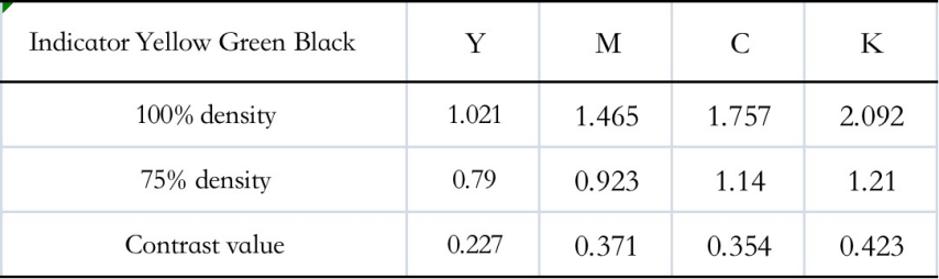
As can be seen from Tables 3 – 6: the relative contrast for Y colour is 0.227, which is an appropriate contrast, the relative contrast for M colour is 0.371, which gives a larger amount of ink and reduces the contrast, and the relative contrast for BK colour is 0.423, which increases the contrast and reveals the full extent of the layers.
3.4.3 Verification of the linearisation of the engraving gravure parameters
(1) Engraved gravure plates
Engraving: engraving of standard test plates with defined electrical engraving curves and parameters such as needle angle, mesh, mesh angle and mesh value.
Measurement: By measuring the ladder and control strip of the standard version, ensure that the difference between the left and right mesh values of the test version is within 2, and that the ladder mesh value is within 2 of the standard mesh value (at least 5 points 100/75/50/25/5). Note that both the copper and chrome mesh values must be acceptable.
(2) Gravure proofing (to check whether the test version meets the requirements)
1) Selection of defined inks and inspection of the inks.
(2) Select the proofing machine and determine the parameters of the proofing machine to proof the standard test plate , Dongguan digital display proofing machine according to the “digital display gravure proofing machine operating instructions” and fill in the “gravure proofing parameters table”.
3) Fine adjustment of the ink washout ratio to achieve a standard field density.
Note: It is best to fix the proofing staff; proofing standard samples according to the company’s quality standards, such as no knife Silk, water printing, ink marks, overprinting accurate; proof left and right colour difference is controlled within 2 on average (subject to the left and right control bar), if the colour difference is too large, the proof should be checked for dents in the rubber, etc.; observe the standard sample under a standard light source to see if the grey balance is significantly off-colour, and whether the special test chart is saturated with colour, etc.
4) Print characteristics capture and print specification determination.
5) Based on the customer’s printing questionnaire, discuss with the customer to determine the inks, substrates and lamination methods to be printed, and determine the types of printing characteristics to be collected based on the customer’s final product.
6) Use a standard test roll that is approved for the customer’s printing press.
7) On press Preparation for printing.
Printing conditions are maintained in normal production conditions and records are kept to fill in the “Printers’ Printing Parameters Record Form” (pressure,
(temperature, humidity, squeegee angle, drying temperature, etc.).
8) Adjust the ink viscosity [ 102 ][103 ][104 ] (Important)
9) Starting with the original ink, determine the appropriate field density by following the previous method of determining the optimum field density.
(10) Printed standard proofs should be strictly in accordance with printing quality standards, such as the absence of knife threads, watermarks, ink marks and accurate overprinting.
(11) The customer carries out different laminations according to the characteristics of their products and records the “printer’s lamination parameters record form” to obtain various laminated samples.
(3) Measurement data
1) Measurement and production of the colour space description file for the print sample, with specific reference to the “ICC Generation and Automatic Colour Separation Operations Guideline”; (see Appendix 1)
Note: Pay attention to the backing when measuring, choose a backing L≥93 ab≤±2
2) Determine the control strip standard data for monitoring the process; the test data is shown in Table 3 – 6.
3) Create an ICC of the printing customer’s characteristics. Data from various proofs are collected to create an ICC file of the customer’s printing characteristics, which is embedded in the colour management system. This can be done by the company’s colour management software
Profilemaker is automatically generated from test data.
(4) Establishing the pre-press process
Based on the ICC files produced, two colour management processes are established for pre-press. The soft proofing process for screens; the colour separation and colour checking process. (See appendix for process flow)
1) Screen soft proofing process. (See Appendix 2)
2) Colour separation and colour checking process. (See Appendix 3)
(5) Colour management process validation
Once the colour management process has been established, it needs to be validated before it can be officially used. Validation is a two-step process.
1) Optional test.
Using test rollers (informal products), the process is verified, mainly by verifying the stability of materials, equipment and personnel in the plate making and printing process. Generally, at least one test is required, but if the conditions are adequate, two or three can be done, and any problems can be analysed and improved before doing it again.
2) small batches of specimens.
The process is validated by selecting suitable manuscripts (official products) under controlled conditions. A trial period of around 10 sets of drafts is used to test the adaptability and stability of the process. Measurement: During the test, the required error standard is within 2 % of the colour difference (or within 0.03 % of the density difference).
(6) Colour management process maintenance
(1) Process testing: the process will be tested every month after it is officially released.
(2) Pre-press, electro-engraving, gravure and printing require the establishment of a daily maintenance system for each process, defining the maintenance content, maintenance intervals and responsible persons for each section.
3) Maintain the company’s quality records and supporting documentation.
3.4.4 Linearisation analysis and discussion
Table 3 -7 Comparison with linearization of MDC

Fig. 3 -35 shows the linearisation curves of the MDC engraver

1,2,3,4 after linearisation. Figure 3-35 shows the ESC curves for the No. 2 cutter of the MDC 1,2,3,4 after linearisation and the No. 0 cutter of the MDC 1,2,3,4 after linearisation. As can be seen from Figure 3 – 35, the results of the linearisation of the German MDC engraving machines 1,2,3,4 are close to the same angle of the engraving cutter and the curves are close to overlapping, indicating good linearisation. The diagonal length of the finest cavities in the highlight section is 30-33µm, while the industry requirement is a minimum cavity length of 42µm in the highlight section. The linearisation increases the fine level of the transfer print to 5%, compared to the currently accepted 10% for gravure printing. In the darker areas, the diagonal length of the cavity is around 135-168µm. In the darker parts of the industry, the diagonal length of the full type of cavity on the plate roller is generally around 170µm when the highest density values are entered.
3.5 Summary of this chapter
By setting the number of engraving lines, the shape of the engraving cavities and the angle of the engraving, an electro-engraving curve suitable for heat transfer printing is established. By setting up a test printing plate, outputting a digital sample and analyzing the engraving cavities, the printing density can reach 1.757 cyan, 1.465 magenta, 1.021 yellow and 2.092 black. This is in line with the industry requirements for gravure printing density. The relative contrast of the print is 0.354 cyan, 0.371 magenta, 0.227 yellow and 0.423 black. The final heat transfer printing electro-engraved colour separation curve was determined to be suitable for gravure printing. By linearisation, the fine level of the transfer print has been increased to 5%, compared to the currently accepted 10% for gravure printing. The diagonal length of the cavities in the darker areas ranges from 135 to 168µm. The diagonal lengths of the full-scale cavities on the plate roller are typically around 170µm in the darker parts of the industry when the highest density values are fed. The linearisation optimises the structure of the cavities and reduces printing faults in the darkened section.
4 Study of a colour space conversion method for high temperature thermal transfer printing paper
4.1 Introduction
4.1.1 Background of the study
In order to reduce the colour difference between the digital proofs and the print proofs, the engraved linearised feature files are embedded in the colour separation process and the ICCProfile file is created by obtaining the data from the digital proofs in accordance with the relevant colour management software and colour measurement instruments. The ICCProfile file is then matched to the digital proofs and the results are measured and analysed for further optimisation.
4.1.2 Study content
X-RITE eye – one is the test instrument for testing and characterising CRTs, and the test was carried out with the IT8.
The X-RITE528 was used to test and characterise the digital samples to obtain the IT8. colour target LAB values. A neural network approach was used to establish and analyse the relationship between CIELab and CMY colours. Establishing a suitable colour space conversion from RGB to LAB for high temperature heat transfer printing based on the linearisation of high temperature heat transfer printing plates.
4.2 Basic theory of colour space transformation
There are two main categories of colour space: device-related and device-independent colour space [105] [106]. The characteristic of device-dependent colour spaces is that even if the same colour Lab values are used, the colour display is likely to be different on different devices, so that each manufacturer develops its own colour characteristics file when developing its own devices. For example, RGB colour spaces for scanners and monitors, CMYK colour spaces for digital cameras, printers and different printing machines are device-related colour spaces. The characteristic of device-independent spaces is that they do not depend on any device, as long as they have the same colour values the colour appearance is the same, e.g. CIEXYZ, CIELAB, etc. Therefore, device independent colour spaces are used as intermediate colour spaces in the colour management system PCS.
4.2.1 RGB additive colour space
The RGB colour mixture is characterised by the addition of colour light, the brighter the light, and the increased energy of the light after mixing.
The RGB colour space is a mixed colour space of colour light and colour, such as monitors, scanners and digital cameras, which are commonly used in printing. These devices reproduce colour according to the mixing principle of colour light plus colour, and RGB can be superimposed in different proportions to form approximately 16.7 million colours. This is illustrated in Figure 4-1.

Figure 4 – 1 RGB color space
RGB is a device-dependent colour space where colours of the same chromaticity are transferred between different devices, hence the term ‘device-dependent colour space’, which is influenced by the device colour characteristics file.
4.2.2 CMYK colour space
The four colours Y, M, C and K can be mixed in a certain proportion to create a superimposition of any colour in nature. The mixing of colours follows the rule of subtractive colour mixing, i.e. the object selectively absorbs the relevant colour light and the remaining colour light is reflected or transmitted. The essence of subtractive mixing is that the brightness is reduced and the energy is diminished. Pigments and inks are mixed and presented in a subtractive way. The CMYK subtractive colour space, which is usually used in printers and printers, is the relevant colour space for the equipment. This is shown in Figure 4-2.
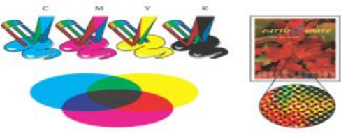
Figure 4-2 CMYK colour space
4.2.3 The CIE colour system
CIE (Commission Internationaled Eclairage), an acronym for the International Commission on Illumination. A series of standard colour spaces in the visible spectrum from 380nm to 780nm have been established. The CIE colour system is based on standard observer and XYZ triple stimulus values. To improve the unevenness of CIEXYZ, the CIE has developed the CIELab and CIELuv homogeneous colour space, based on the previous consideration of colour heart influences.

Figure 4 – 3 CIEXYZ colour model
The CIELab chromaticity space is a ‘mental colour space’ based on Herring’s four-colour opposing colour theory, where the horizontal coordinate is the red-green response of ganglion cells; the vertical coordinate is the yellow-blue response of ganglion cells; and the third dimension is the black-white response of ganglion cells. The advantage of this colour space is that it provides a better response to the mental perception of colour when the colour difference is greater than the threshold range of the human eye. The CIELab chromaticity diagram is shown in Figure 4-4.
CIELab is a device-independent colour model that is a bridge to the colour space conversion model. The CIELab colour space describes all the colours that a sighted person can see, and is a device-independent colour. The colours in CIELab therefore remain the same regardless of the device used to display them.

Figure 4 – 4 CIE Lab model
A. Brightness = 100 (white) B. Green to red component C. Blue to yellow component D. Brightness = 0 (black) Fig. 4 – 4 CIE Lab model
A. Luminance white B. Quantity from green to red
C. Quantity from blue to yellow D. Luminance black
The CIEXYZ system has a non-linear relationship between the quantitative representation of colour and the perception of colour by the human eye and mind, and its chromaticity diagram has a non-uniform colour tolerance. The geometric distance between two points on the CIEXYZ chromaticity diagram does not correspond exactly to the visual perception of colour. Therefore, the CIE has introduced a psychological colour space to create a colour tolerance of the eye.
The CIEL*a*b colour space is the universal uniform colour space recommended by the International Commission on Illumination. The non-linear transformation of the CIEXYZ non-uniform colour space gives the CIEL*a*b* uniform colour space, which is now used as the universal colour space for all countries in the world.
The greatest advantage of the CIE 1976 L*a*b* uniform colour space is that the human eye can better reflect the mental sense of object colour when the colour difference is greater than the visual threshold of recognition (just perceptible), which is less than the difference between two adjacent levels in the Menzel system. The conversion formula is as follows.
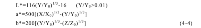
Where: X, Y, Z are the tri-stimulus values of the colour sample; X0, Y0, Z0 are the tri-stimulus values of the CIE standard illuminant; L* is the psychometric luminosity, referred to as the luminosity index or psychometric luminosity; a*, b* are the psychometric chromaticity, referred to as the chromaticity index or psychometric chromaticity.
The CIEL*a*b* colour space is a mental colour space. In this coordinate system, a*>0 means red, a*<0 means green, b*>0 means yellow and b*<0 means blue. The luminosity of a colour is represented by L*. This is because the CIEL*a*b* colour space contains all the physically achievable colours. The colour difference is the numerical representation of the difference in perception between the colour to be measured and the standard colour by selecting a standard colour. This way the colour is expressed in a way that is more in line with the psychological observation of colour. Both colour samples are measured using
The difference in colour between L*a*b* and the calibration colour, ∆E*ab, can be calculated using the following formulae 4 – 5.
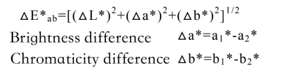
(4 – 5)
The national standard for colour reproduction quality of printed matter requires the same colour difference in the same batch of colour printed matter to be: △E*ab ≤ 5.00~6.00 for general products and △E*ab ≤ 4.00~5.00 for fine products.
Printing is a continuous reproduction process in which the printed image is the result of a superimposition of four-colour ink dots in CMYK inks in varying percentages of dots from 0 to 100%, depending on the percentage of dots superimposed to form the layers and colours of the print. In general, the higher the percentage of dots, the darker the colour. The CMYK colour space is an equipment-dependent colour space, i.e. the same set of C, M, Y and K dot area ratios, whose colour rendering is influenced by the process parameters, paper type, ink type, printing equipment, etc. in the printing conditions. The CMYK colour space is often referred to as the colour space associated with the equipment. The CMYK colour space is not a one-to-one mapping relationship. When the Lab value is determined, there are various combinations of different CMYK dot percentages that can be represented and printed under the same printing process. This creates problems for colour management and makes it difficult for printers to reproduce colours in a uniform way. This is why it is necessary to study the colour space conversion in the printing and reproduction process.
4.2.4 Method of colour space conversion
(1) Polynomial Regression
Based on the additive nature of the colour triple stimulus values, a mathematical algorithm [107] is selected to establish a regression model based on the relationship between the input and output values, and the relevant parameters in the model are determined to establish a colour space conversion model.
(2) Three-dimensional look-up table method (Look-up table)
For 3D look-up tables [108], the method has been developed to a relatively high level of maturity. If the colour space is too large, it increases the spatial and temporal complexity of the colour matching algorithm model and makes matching slow; if it is too small, it will not reflect and represent the essential features of all colours in the colour space.
(3) Modeling method
The advantage of the Nürnberg equation is that the principle is clear and can be solved by measuring only a small number of ink samples. In practice, however, it has been found that there is a large discrepancy between the dot values calculated using the Nürnberg equation and the actual dot values obtained from printing, and that using directly calculated values to guide actual printing can lead to large colour errors in the print. For this reason, many scholars have made corrections to the Nürnberg equation. The various correction methods proposed so far are either more complex to solve, or the correction factors are not easy to determine or are poorly generalised. As a result, the use of the Nürnberg equation for colour space conversion in printing equipment is still very limited.
(4) Neural network method
The application of BP neural networks to print colour space conversion, when given an input colour value, can correspond to an output result according to the neural network algorithm. This is similar to the RGB input and CMYK output in printing. Using this method, it is possible to establish a mapping relationship between the colour conversion of the printing output device and the input device, thus creating a colour conversion model of the device that is more accurate. However, due to the complexity of the colour space, there is still a large error in the accuracy of the conversion of the whole colour space. Colour conversion models based on the neural network approach are a recent research direction and have been applied to print output devices. Because the human eye is influenced by psychological factors and the wide capacity of the human eye, the accuracy of this method in describing colours and colour transformations is not yet satisfactory. This project addresses the shortcomings of existing methods for colour characterisation of printing equipment and, based on previous research, proposes a new approach to the characterisation of printing equipment based on a neural network approach to the division of dynamic colour space.
Artificial neural networks [109] are highly capable of dealing with non-linear relationships, error back propagation and are the most widely used BP neural networks, which have the characteristics of fuzziness, high-speed parallel processing and non-linear mapping, and are well suited to the characteristics of the colour space conversion process. The principle is shown in Figures 4 – 5.Show.
Input layer Hidden layer Output layer
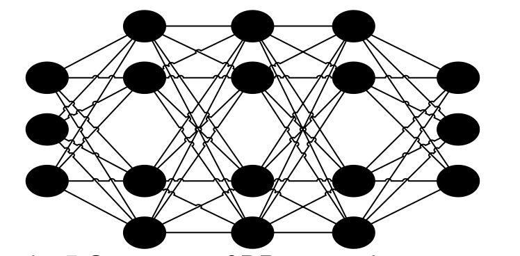
Figure 4 – 5 Structure of BP network
BP neural networks as a basis for colour space conversion methods.
a. BP Neural Networks Fuzzy and Visual Ambiguity
The BP network has a certain degree of ambiguity; the human eye also has ambiguity when observing colours. 1) The trichromatic cone perception cells perceive the three primary colours in a highly non-linear and ambiguous manner according to the theory of step theory. 2) Hue, lightness and saturation are the three attributes of colour, which constitute the mental colour space and are ambiguous. 3) The complexity of colour information processing systems in printing creates uncertainty. The fuzzy nature of the BP neural network is therefore very much in line with the fuzzy intelligence of the human eye in processing visual information about colour.
b. High-speed parallel processing of BP neural networks
Modern computers process digital signals such as printed colour images in parallel, and BP neural networks are characterised by parallel internal processing and transmission of information. The hardware links can be completed in a few tens of nanoseconds and are perfectly suited to the requirements of colour video signals.
c. BP neural network non-linear mapping capability
Printed colour space conversion is not a linear mapping relationship and one of the main features of the BP network is its non-linear mapping capability. This is why it meets the needs of print colour space conversion.
The structure of a BP neural network consists of three layers: an input layer, an implicit layer and an output layer. The number of layers and the number of neurons in the middle layer of the network can be varied according to the needs of the research project, and the relationship between input and output can be expressed in equations (4 – 6).

4.3 RGB-LAB transformation model based on dynamic subspace partitioning in BP neural network theory Research

Figure 4 -6 Experimental Technology Roadmap
Fig.4 -6 Diagram of technology roadmap
4.3.1 BP Network Structure and Learning Rules for RGB to Lab Transformation Models
The conversion from RGB colour space to L*a*b* colour space is a three-input, three-output system based on the relationship between input and output, and this paper uses Matlab to model the conversion from RGB to L*a*b* colour space. The structure of the BP neural network for the transformation from RGB to Lab is shown in Figures 4 – 7.
Figure 4 -7 Structure of BP networkRGB to Lab
The excitation values of the red, green and orchid sensory cells are used as input values, and the chromaticity value Lab is the output value; any of the hidden layers can be used as needed;a1~ai
and b1~bj are the output values of the first and second hidden layers respectively; θa 1~θa i
and θb 1~θb jare the threshold values of the cone chromatophore excitation values; w
(0) 1 ~ n i w(1)ij, w(2)jr, jg, jb are the connection weights between the cells. , jg, jb are the connection weights between cells. The thresholds and connection weights of the cone chromatophores are initialised so that their values are randomly distributed over the interval [-1,1]. The final input and output are normalised to the value of [-1,1].
Distribution on 0-1 . Feedforward process.

(4-7)
where xn R, G, B , f (x) 1 (1 e x ), f (x), also known as the Sigmoid function, has the following characteristics: as the absolute value of x increases, the values of the functions tend to 0 and 1, respectively.
Correction formula for weights and thresholds.

where < 1 is the step size, < 1 is the inertia factor, n is the current training sample group number, and n + 1 is the previous sample group number.
Accurate conversion from RGB to CIELab is achieved and the accuracy of the colour space conversion model is evaluated by the colour difference of the colour blocks Eab*.
The formula for colour difference is

L0, a0 and b0 are the measured values before network conversion, and L, a and b are the calculated values for network training.
4.3.2 Optimisation of the RGB to Lab conversion model for dynamic colour space division based BP neural network systems
The neural network method is now recognised by many scholars as the most common method for colour space conversion, and is a more accurate response to the characteristics of colour as observed by the human eye. Most of the research has been focused on learning to sample the entire colour space by adjusting the weights of each node.
In turn, a neural network model is constructed between the input and output values. The results of the above study suffer from spatial over
The problem of large sample points is not centralized. A total of 56 colours were used as sample points for the BP model using a 5-layer BP neural network structure as the basic data set. The accuracy of the model was analysed and the average colour difference between the output values and the actual measured values was found to be approximately 1.4012NBS. The colour difference range is small, but the 5-layer neural network structure takes too long to train the samples and affects the accuracy of the model in converting the colour difference. Therefore, this thesis proposes to use a dynamic subspace partitioning method to divide the RGB colour space, and use a BP neural network model to convert between RGB colour space and L ab colour space. The solution is to dynamically divide the RGB colour space into several subspaces, and to adopt the sample points for modelling according to the similarity of the subspaces, which can greatly reduce the complexity of the input colour space and, to a certain extent, avoid the phenomenon of local optimality in the neural network model and improve the conversion accuracy of the model.
(1) Rational selection of several modeling sites
In order to optimise the colour space conversion, the modelling sample points [118] should be selected reasonably, and the monitor should be calibrated according to the reference literature, using CorelDraw [119] to design 56 colour blocks with 8 levels of grey gradient and 8 levels of red, green, blue, yellow, magenta and cyan gradients, with a block size of 10 x 10 mm (to meet the requirements of the spectrophotometer for measuring colour values). The RGB values for each colour block were incremented in 32 steps, as shown in Figure 4-10. The L*a*b* values for each colour block were measured using the EYE-one.

Figure 4-8 the color mass of modeling
Theoretically, the finer the dynamic aliquot, the higher the accuracy of the model. However, according to the theoretical analysis of neural networks, if the number of samples is too large, it will increase the number of measurements and increase the size of the network structure and training time.
This paper is based on an exploratory approach in which R, G and B are divided into four, five and eight equal parts. Therefore, in the spirit of this thesis, R, G and B have been divided into four, five and eight equal parts. This is because R, G and B are taken in the range of (0-255) respectively.
When the R, G and B colour axes are quadratured, the R, G and B values are 0, 64, 128, 192 and 255 respectively, giving a total of 125 or 53 sets of data, so that the number of data points modelled across the dynamic R, G and B colour space is 125 + 56 = 181.
When the R, G, and B colour axes are quintupled, the R, G, and B values are 0,52, 104,156, 208, and 255, respectively, for a total of 216 or 63 data sets, resulting in 216+56=272 data points for modelling the entire dynamic R, G, and B colour space.
When the R, G and B colour axes are octeted, the R, G and B values are 0, 32, 64, 96, 128, 160, 192, 224 and 255 respectively, giving a total of 729 or 93 sets of data, giving 729 + 56 = 785 data points for modelling the entire dynamic R, G and B colour space.
These three sets of samples were used as the data set for the construction of the dynamic neural network model.
(2) The number of network layers and transfer functions, the number of nodes in the hidden layer, and the learning rate are selected reasonably. The modeling parameters are chosen reasonably for the whole colour space to build a reasonable neural network model [120][121].
a. Number of network layers
The number of hidden layers and the number of neurons in each hidden layer of a BP network affects the convergence characteristics of the network. It is shown that the number of hidden layers and the number of neurons in each layer can only be selected appropriately to ensure the convergence of the BP network. To summarise the results of previous studies, the following rules can be found.
1. For a BP neural network with a single hidden layer, the number of neurons in the hidden layer can be chosen so that it can approximate a continuous function with arbitrary accuracy.
2. The volatility of the approximated function increases as the number of hidden cells increases.
3. If the total number of learning samples increases, the number of hidden units should also increase, which will increase the training time.
4 . The complexity of the network and the number of learning samples will affect the speed of convergence of the network, so the size of the network should be kept to an optimum size.
5. Reducing the number of cells in each hidden layer and the chance of falling into local minima can be achieved by appropriately increasing the number of hidden layers. In practice, multi-layer nets should be used.
To comply with the above rule, the BP network is generally selected with three layers, i.e. the input layer, the hidden layer and the output layer. In the process of printing colour space conversion, when the number of model samples is large, a hidden layer can be added in order to improve the conversion accuracy, but not too many. In this chapter, four layers are chosen as the number of layers according to the recommendations of the literature. The number of neurons in each layer of the network is usually determined by the application. The number of neurons in each layer of the network is usually determined by the application. For a 3-input, 3-output system, a 4-layer BP network structure (i.e. input layer, output layer and 2 hidden layers) is used to transform the colour RGB colour space into L*a*b* colour space.
b. Passing Functions
The network’s hidden layer neurons are trained using the elastic gradient descent method trainrp, with the log-sigmoid function logsig () and the purelin () function for the output layer neuron transmission.
c. Number of nodes in the hidden layer
The number of neurons in the hidden layer determines the accuracy, the more the better, but it is easy to produce overfitting and thus reduce the generalisation ability; of course, if there are too few nodes, underfitting will occur, reducing the approximation accuracy and the convergence ability of the learning process. The number of nodes for each hidden layer was determined to be 20 after several trials.
d. Learning rate
Since the human eye has a tolerance for colour in the range of 0.0015 to 0.0025 x or y colour coordinates, the training accuracy is 1 and the learning rate is 0.2. The average colour difference of the 56 blocks is 1.4012 according to the colour difference formula (4 – 9).
(3) Verification of the accuracy of the neural network model.
The entire RGB colour space is dynamically divided into 27 subspaces, and the 27 cubes are used as parameters for verifying the accuracy of the model conversion.
The colour space was divided into 64 subspaces using fuzzy theory, and a neural network model was developed for each subspace. A preliminary investigation was made and a project was applied to the Shaanxi Provincial Education Department as a future research project.
Applying the above transformation model to colour management holds the promise of achieving colour in digital print reproduction
The reproduction of the colour difference is accurate to ΔE ≤ 5-6 NBS.
The new idea of characterisation of digital printing equipment is expected to improve the level of colour management technology, and the finished colour management files of this equipment will be used in the production and colour separation process of transfer printed products, reproducing the original colour accuracy perfectly and improving the level of transfer printed products.
4.3.3 Construction of a colour RGB to LAB colour conversion model based on a BP network structure
Converting from RGB colour space to LAB colour space, as any change in any of the three attributes of the three primary colours RGB will result in a significant change in colour.
(1) Modeling
In (1) of 4.3.2, a reasonable number of modelling points have been taken, and the colour blocks for the modelling and verification points were designed using the image processing software coredraw [122].
In the CIERGB colour space, any colour coordinate point X(r,g,b) in the RGB colour space is selected as the input point for the modelling, and the distance between point X and the modelling point in the colour space is calculated using the two-point formula. The distance between the X point and the colour space modelling point is calculated by using the two-point formula. The minimum distance between the X point and the X point is selected and the radius of the space is obtained by using the BP neural network algorithm. The number of points is 15, 20, 30, 40, 50, 60, 70, 80, 90, 100, 110 and 120, depending on the fineness of the subspace division, and the RGB input space is dynamically divided into several subspaces according to the input points. The colour space transformation model is based on the dynamic subspace division.
(2) Mould accuracy analysis
When the total number of sampled space points modelled in the dynamic subspace is 180, 27 colour blocks are input as model validation data and the relationship between the number of points modelled and the average colour difference of the validation points is shown in Figure 4 – 9.
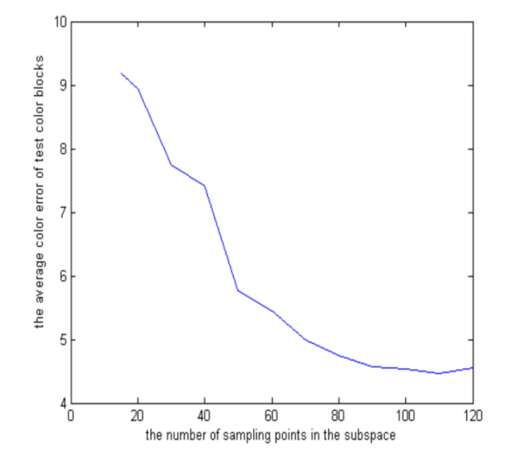
Figure 4-9 the relationship curves on the number of sample points in the subspace and the average color error of test color blocks when the total sampling points are 180 points are 180
As can be seen in Figure 4-91, the higher the number of points modelled in the subspace of the model, the lower the average colour difference of the validation blocks. It can also be seen that as the number of points in the subspace increases, the average colour difference of the validation blocks tends to level off. When the number of modelling points in the subspace of the colour model reaches 70 or more, the average colour difference of the output of the colour model is less than 5△E*ab; when the number of modelling points in the dynamically divided subspace of the colour model is less than 15, the average colour difference of the validation colour block is about 9.19△E*ab; when the number of modelling points in the dynamically divided subspace of the colour model is 120, the average colour difference of the validation colour block is 4.56△E*ab. ab; as the number of modelling points increases
In addition, when the number of modelling points in the dynamically divided subspace reaches 130, the subspace becomes more difficult to train the model, the training time is longer and it is difficult to achieve output accuracy for the training sample points.
When the total number of modelling points is increased to 270, 27 blocks of colour are entered into the model as the validation blocks for the model.
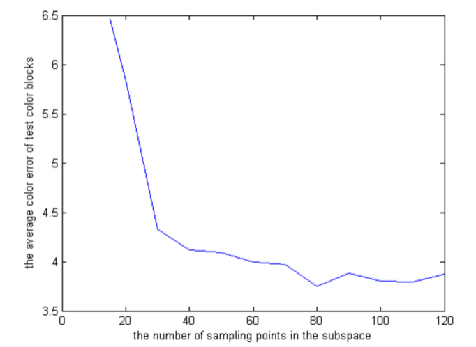
Figure 4-10 the relationship curves on the number of sample points in the subspace and the average color error of test color blocks when the total sampling points are 270
As can be seen in Figures 4-10, the average colour difference of the check blocks decreases as the number of models in the model subspace increases. It can also be seen that as the number of points modelled in the subspace increases, the average colour difference of the check blocks tends to level off. When compared to Figure 4-11, it can be seen that the accuracy of the model transformation improves considerably when the dynamic colour space is divided into smaller subspaces containing the same number of sample points. When the number of modelled data points in the dynamic subspaces of the colour model reaches 60 or more, the average colour difference of the output of the colour model is less than 4∆E*ab; when the number of modelled points in the dynamic subspaces of the colour model is 120, the average colour difference of the validated colour blocks is
3.87 ΔE*ab .
When the total number of modelled sample points was increased to 729 and 27 blocks were entered into the model as validation blocks, the relationship between the number of modelled points and the average colour difference of the check points within the subspace of the model can be seen as shown in Figure 4-14.
As can be seen in Figures 4 – 11.
When the number of sample points is increased to 729, 27 validation blocks are fed into the model and the average colour difference of the validation blocks becomes smaller as the number of modelled subspaces in the model increases. In comparison to Figure 4-12: the accuracy of the model transformation is greatly improved, with the average colour difference of the colour model output being less than 2∆E*ab when the number of modelled data points in the dynamic subspace of the colour model reaches 50 or more; when the number of modelled points in the subspace of the model is With 120 modelling points, the average colour difference of the test blocks is 1.65∆E*ab.

Figure 4-11 the relationship curves on the number of sample points in the subspace and the average color error of test color blocks when the total sampling points are 729
It can be seen that the accuracy of the colour model transformation increases as the number of modelled samples in the colour model subspace increases, but the accuracy of the model transformation plateaus when a certain number is reached. At the same time, as the number of model points in the dynamic subspace increases, it becomes more difficult to train the BP neural network model and the accuracy of the model output decreases. In addition, by dividing the colour space into dynamic subspaces, the smaller the subspace containing the same number of modelled points, the higher the accuracy of the model transformation.
(3) Analysis of results
a. In the RGB to Lab transformation, a network structure with four hidden layers and less than 15 neurons per layer can be used; b. The dynamic sampling scheme proposed in this chapter overcomes the shortcomings of the conventional uniform sampling scheme, thus improving the overall accuracy of the RGB to Lab transformation.
c. In the model validation, 27 colour blocks of a small cube are used to verify the accuracy of the model, which is more convincing.
d. Experiments have shown that with 729 sampling points and a subspace containing 120 sample points, the average conversion accuracy can reach 1.65∆E*ab, both of which are in the range of small colour differences and can meet the requirements of most practical applications.
4.4 Colour space conversion in heat transfer printing
A theoretical analysis of the conversion of RGB to LAB colour space was developed based on the theory of neural network BP structures and applied to the heat transfer printing process. To convert RGB into LAB space, RGB values are obtained, so this part is divided into two experiments.
The CRT of the computer screen was used as the object of study for the colour space conversion. The accuracy analysis is carried out.
4.4.1 Experimental materials and apparatus
Depending on the material to be scanned, select a standard scanner calibration card that is the same as (or similar to) the material being scanned. This is shown in Figures 4-12 and 4-13.

4.4.2 Experimental methods
(1) Preparation for scanning
Turn the scanner on to warm up and check the scanner’s operating status, if normal, you can continue. Turn off the colour control and adjustment functions and colour management functions in the scanning software so that the scanner can capture the original RGB data directly from the scan. Clean the scanner’s glass plane or the paper base, and clean the surface of the scanner’s dedicated swatch to remove creases, dirty spots and other defects.
(2) Scanning of colour cards
Select the parameters in the scanning software: select a resolution of 300 dpi, scan mode RGB colour, colour bit count 24, etc. Place the standard colour card in the scanner and scan it to obtain a scanned colour card image. Open the image in photoshop and remove any defects such as dots or creases and save the image as a tiff file.
(3) Producing scanner colour characteristics files
Open the ProfileMaker function in the X-Rite ProfileMaker Pro 5 software, select SCANNER and in Reference Data select the reference data file for the colour card to be scanned as shown in Figures 4 – 14 and 4 – 15.
Figure 4 – 14 Opening the profile of profileMaker Figure 4 – 15 scan the color charts
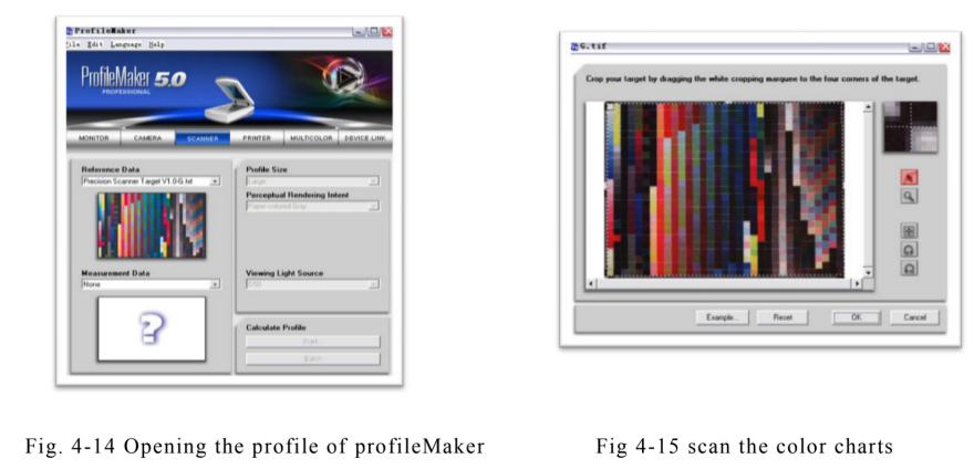
Open the saved colour chart scan TIFF file in Measurement Data. If This is shown in Figure 4 – 16.Open the saved color chart scan TIFF file in Measurement Data. As shown in Figure 4-16 shows.
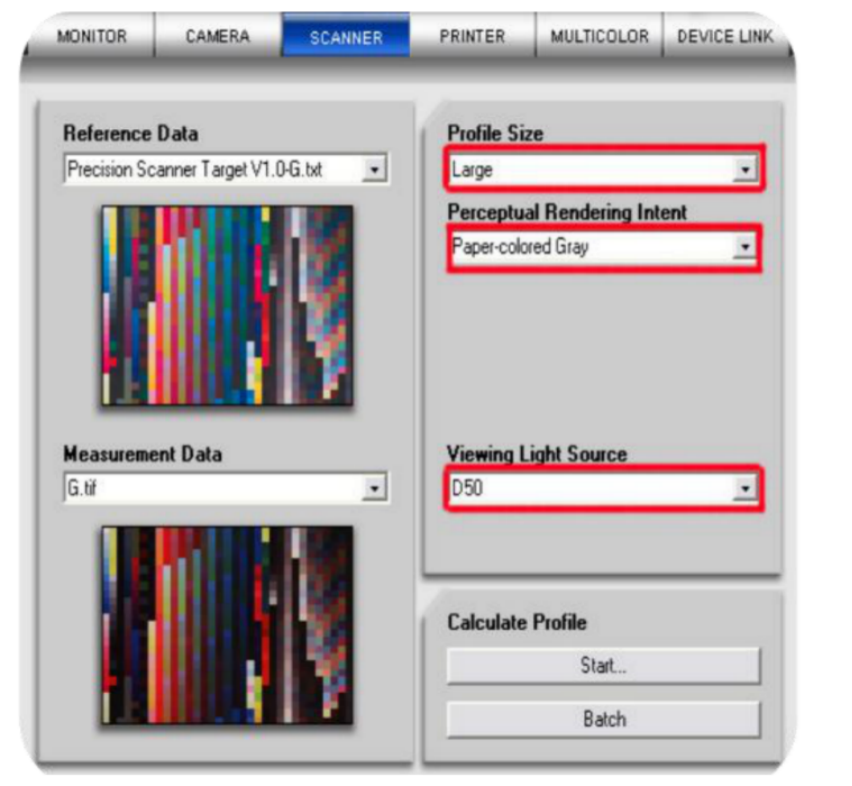
Figure 4 – 16 save the digram of TIFF
Adjust the position of the dotted box so that the image is in the same position as the colour block in the reference file. In the dialog box, select Large for the Profile size, paper colored Gra y for the Perceptual Rendering Intent, and Viewing Light Source according to the viewing source used. Select the light source to be used. Click on the Start command, name it and save the icc to the specified path, i.e. the scanner’s Profile.
(4) Installing the scanner colour characteristics file
Select the scanner icc profile file , click the right mouse button and select “Install Profile”. Or copy the scanner icc profile file to C:\WINDOWS\system32\spool\drivers\color Ready to use.
(5) Scanned manuscripts
If the scanning software supports ICC colour management, place this scanner icc profile file directly into the place specified by the scanning software so that it can be selected for recall during scanning. Note: Turn off
If the scanning software does not support or does not want to embed the scanner icc profile in the scanning software, you can open the scanned icc profile in Photoshop after scanning is complete (with the colour control and adjustment function in the scanning software turned off). If the scanning software does not support or does not want to embed the scanner icc profile in the scanning software, you can open the scanned RGB image in Photoshop after the scan is complete (with the colour control and adjustment functions in the scanning software turned off), specify the scanner profile (specify the configuration file) and embed the scanner icc profile when saving the image. profile file when saving the image. As shown in 4 – 17.
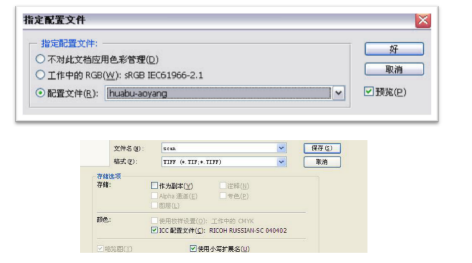
Figure 4 – 17 icc profile of scanner
(6) Notes on setting up the scanner
a. Select a standard calibration card for the same or similar material depending on the type of scanned document.
b. Pay attention to the use period of the standard calibration card, if it is out of use or severely damaged, the standard calibration card should be recalibrated and a new reference file obtained before the scanner icc profile is made.
c. Check the working status of the scanner, if the scanner is not working steadily or if there is a large difference between the status when scanning and the status when doing the scanner icc profile, recalibrate the scanner and redo the scanner.
icc profile.
d. When naming the scanner icc profile, it is recommended to include the scanner number and the calibration card number.
(The information such as media, shelf life etc., calibration time etc. is used to differentiate and correctly call the corresponding parameters. The scanner scans the standard colour target data and then performs the colour space conversion of the display according to the characterisation file for colour space conversion.
4.4.3 CRT colour space conversion analysis
(1) CRT colour space conversion
A brand of computer monitor was chosen as the target of the study, and a set of RGB colour blocks was created using the coreldraw software, and the RGB colour space was segmented according to a colour scale of 5 [124]. Lab values. The Lab values for the above colour blocks were measured using an X-RITE 528 spectrophotometer and are shown in Table 4-1. The Lab values from the model conversion were analysed and compared with the measured Lab values. Based on the data in Table 4-1, the curves were plotted as shown in Figure 4-18.
Table 4 – 1 Ideal and measured L-values
Tab4 – 1 The value of L between standard and practice

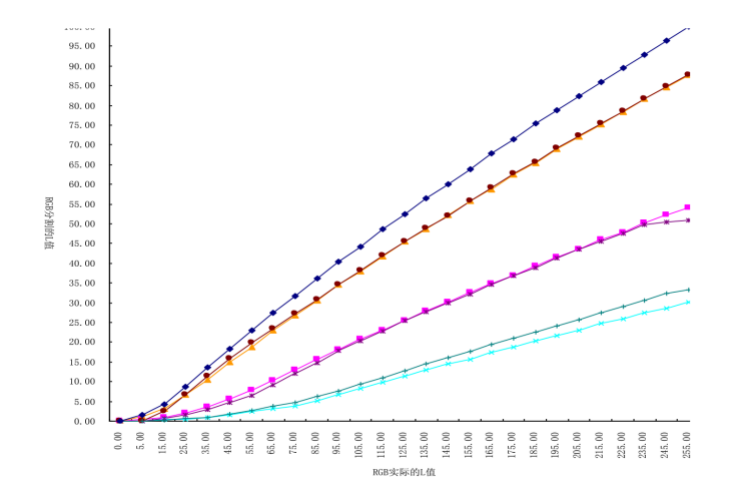
Figure 4 – 18 the relationship between L and RGB
The RLc, GLc and BLc lines are the L-value curves of the RGB equivalent blend in coreldraw, while the Lr, Lg and Lb curves are the measured RGB blend curves.
(2) Discussion and analysis of results
As can be seen from the curves in Figure 4-18, both the model-transformed luminance L values and the measured luminance L values are single-valued functions of R, G and B. This allows a functional relationship to be established between the two. This allows a functional relationship to be established between the two, assuming that the monitor [126] RGB triple shot is sufficiently independent, as the monitor displays colour according to the RGB colour rendering principle, and that if the actual RGB output L value matches the ideal RGB L value, an ideal neutral grey balance can be obtained. The function of the relationship between luminance L and RGB can be achieved by an interpolation algorithm. The algorithm is executed in C++.
The block diagram of the algorithm is shown in Figure 4-19.

Figure 4 – 19 Algorithm block diagram
(3) Model accuracy analysis
When L=16, the input colour block value is tested and the ideal input value R=G=B=39.9 can be deduced from the L value. The
The interpolation function established by the algorithm calculates: R=44, G=38 B=38. Calculate the errors in R, G and B
The colour difference is 44 -39.9=4.1; 39.9 -38=1.9; 39.9 -38=1.9. The colour difference can be calculated as ΔE=4.9ΔE*ab. According to the current print quality regulations GB/T7705-20088, ΔE≤4~5ΔE*ab is a fine product and the colour difference ΔE≤5~6ΔE*ab is a normal print. The monitor grey balance correction [127][128] model is able to achieve fine colour reproduction and has a relatively high model accuracy.
4.5 Summary of this chapter
This chapter investigates the conversion of the colour space of heat transfer printing products based on the BP neural network theory of dynamic subspace division. The colour space conversion model was embedded in the ICC file of colour management and the ICC file was applied to the computer colour separation of a well-known plate making company. ΔE*ab ≤5~6 for general printing products; ΔE*ab ≤4~5 for fine products. According to this algorithm, the grey balance correction of the display can basically achieve the condition of fine colour reproduction. The accuracy of this algorithm is therefore relatively high. From the above conclusions it can be seen that the colour space conversion method based on the BP neural network theory of dynamic subspace division is suitable for the colour separation and colour space conversion of transfer printing paper and provides an effective method for improving the colour management of heat transfer printing.
5 High temperature thermal transfer printing paper Printability study
5.1 Introduction
5.1.1 Background of the study
In today’s fast-changing information technology, digitalisation and networking, for people with a very rich material life, bright and gorgeous clothes and elegant and comfortable homes have become the direction to pursue, transfer printing is flourishing and its craft products are constantly meeting people’s needs: beautiful and fashionable clothes, elegant and generous curtains, carpets, sofa tops, coffee table cloths and so on. At the same time, the effect achieved by the printing process, i.e. the quality of the product, cost performance, etc., has put forward higher requirements: whether the fabric pattern is fine enough, whether the resolution is up to standard, whether the colours are bright and full, whether the product can show the trend of personalised differentiation, whether the transfer printing has an impact on the performance of the original fabric, etc., so the process needs to be continuously improved and researched to meet people’s needs. This is why the process needs to be constantly improved and researched in order to meet the needs of the people. Although heat transfer printing has been studied at home and abroad for many years, and some of the technologies have been applied in industrial production, this paper analyses and studies the shortcomings of domestic paper by comparing the printability of domestic and foreign paper, while evaluating the printing effect of the paper, in the hope of improving it to make up for its own shortcomings and increase its competitiveness in the market. This chapter draws conclusions from a careful analysis of the experimental comparison between the image quality of the final printed fabric and the image quality of a standardised gravure print that is already well established, in the hope of making a small contribution to the fabric printing industry.
5.1.2 This chapter examines
The main elements of the study in this chapter are: an introduction to the structure and printability of thermal transfer printing paper, tests on the physical parameters of paper such as whiteness and opacity, and an analysis of the printability parameters of transfer printing paper, field density, colour gamut, dot gain and relative print contrast.
5.2 Printability study of high temperature thermal transfer printing papers
High temperature heat transfer paper [129] consists of a transfer base paper, a release agent, a printing ink layer and a hot melt adhesive layer, the structure of which is shown in Figure 5-1.
5.2.1 High temperature heat transfer paper structure
(1) Raw paper
The substrate layer is required to be resistant to high temperatures, to prevent bleeding, to resist heavy pressure, to have low dye gas permeability and to have a high tension paper; the surface is smooth to enable fine patterns to be printed; the high temperature resistance is generally instantaneous.
About 20 seconds to withstand a temperature of about 200°C (the paper does not scorch or become brittle); and sufficient strength, generally 50-70g/m2 in weight, 40-100g/m2 in absorbency and 500-2000 in permeability.
mL/min.
(2) Release agent layer
The heat transfer layer is a key factor in determining the quality of the transfer print. The release agent layer itself is characterised by good application properties, i.e. good ink absorption, release properties, film strength and water resistance. The release agent should have the following characteristics in its work: good ink absorption when printing on printed paper, instantaneous peeling when transferring, and the ability to apply the release agent as a glossy oil for the ink on textiles after the transfer has been completed, to provide a glossy finish. The strong adhesion between the release agent layer and the paper guarantees the quality of the transfer and the ability to withstand several washes without fading after the transfer to the fabric.
(3) Printing ink layers
This layer is fundamental to the aesthetics of the texture of the transferred product . The various colours of oil printed onto the paper base according to the image requirements
Ink is the key to determining the vibrancy of colours on textiles. The printing of the required graphics is achieved by means of advanced printing technology and image processing methods. This thesis focuses on the effects of gravure printing methods.
(4) Hot melt layer
After the printing ink layer has been completed, it is applied to the printing ink layer by means of printing, which acts as a bonding layer between the ink receiving layer and the base paper layer prior to transfer. The hotmelt layer has to be matched to the substrate and should be selected according to the substrate due to the differences in chemical composition of the different hotmelt layers.
Fig. 5 – 1 Structure of the thermal transfer paper
1 – base paper, 2 – release agent layer, 3 – printing ink layer, 4 – hot melt adhesive layer, 5 – substrate
In the printing and transfer process, the paper properties of the thermal transfer paper are required to be of the right weight and uniformity
Good uniformity, physical strength of the paper such as folding resistance, tearing, breaking resistance, surface strength, tensile strength is sufficient to ensure that the printing process does not appear in the lint, powder, ink layer peeling failure; transfer of ink sublimation dispersion evenly, the pattern is uniform and not deformed; high smoothness to ensure the need to print fine patterns; surface smoothness to high, the ink dye penetration absorption to minimize; high temperature resistance, and in the High temperature transfer process of paper and ink easy to separate.
5.2.2 Heat transfer printing inks
Transfer printing inks, also known as printing pastes and inks, are important materials in the transfer printing process and are one of the key factors in determining the quality of the transfer printing. Transfer printing pastes [ 130 ] are divided into three main categories: water-soluble, alcohol-soluble and oil-soluble. Alcohol-soluble and oil-soluble inks are environmentally polluting and belong to the elimination of ink types; water-soluble inks are green and environmentally friendly and are the future trend in printing, so the use of water-based inks is inevitable, but they can easily cause deformation of the transfer paper. The printing pulp is mainly composed of dyestuffs, connecting materials and auxiliaries.
(1) Dyes
The colours used for transfer printing are mainly disperse dyes, which sublimate below the melting point of the cellulose macromolecules in the paper and do not damage the strength of the fabric. In order to meet the needs of transfer printing, the dyes should have the following properties: the dyes must be resistant to temperatures of 210°C and at this temperature they must be able to sublimate sufficiently and adhere to the fabric fibres and have good washing fastness and ironing fastness when transferred to the fabric. The transfer dyestuff is distributed on the surface of the fabric and spreads evenly into the fabric fibres. The affinity of the dye for transfer printing should be greater for the fabric than for the paper and the colour fastness should be high. Transfer printing dyes should be bright and vivid.
(2) Connection material
The linker is generally an inexpensive, non-toxic, film-forming and non-combustible substance. The function of the linker is to distribute the dye evenly in the ink and to transfer the dye to the paper. The common types of binding agents are water, solvents and oils. Transfer printing paper is mainly made of cellulose, a hydrophilic organic polymer. When water is used as the connecting material, the fibres tend to absorb water and swell, making fine patterns easily distorted. The organic solvent-based joining materials have a higher evaporation rate, less paper distortion and can be printed with fine patterns, which is conducive to high production speeds. In the transfer printing market, solvent-based materials account for a high proportion of the market, but have the disadvantage of being costly, flammable and polluting. There are also oil-based materials, such as high boiling point oils. The presence of high boiling point oils can cause the dye to diffuse into the transfer paper, reducing the transfer rate from the transfer paper to the fabric.
(3) Auxiliaries
The amount of binder determines the viscosity of the colour ink, which has the greatest impact on the transfer effect of the transfer paper. If the amount of binder is too large, the transfer of dyestuff from the transfer paper to the fabric will slow down, which will reduce the transfer rate, too much dyestuff remains on the printing paper, affecting the colour of the print on the fabric. The requirements for the binder are a small affinity with the dye, suitable printability, preservation and thermal transferability.etc.
5.3 Experimental content and methods
5.3.1 Experimental materials
Imported heat transfer printing paper, proof paper, domestic kraft paper, newsprint, imported proof paper inkjet proofs, post-transfer waste paper, fabric [131].
5.3.2 Experimental apparatus
X-Rite spectrodensitometer, electronic mercury-free smoothness tester, electronic balance, paper thickness tester, microcomputerised tensile strength tester, whiteness tester, ZQJ10 paper tearing tester, YQ-Z-31 folding resistance tester, Guerrai permeability tester.
5.3.3 Test sample parameters and methods
(1) Quantitative determination
Cut five 100mm x 100mm (or equivalent) paper samples with a paper cutter, measure the mass with an electronic balance and calculate.
(2) Smoothness test
a. Cut 10 front sheets of 50 mm x 50 mm specimens along the width at a distance of 15 mm from both sides of the paper and ensure that there are no creases, cracks or other paper defects on the surface of the specimen.
b. Place the measured surface against the surface of the glass plate, then place the pad and upper platen on the specimen and apply a pressure of 100 soil 2 kPa to create a vacuum of 50.66 kPa in the vacuum vessel. Measure and record the time taken for the vacuum to drop from 50.66 kPa to 48.00 kPa, expressed in S (seconds); first test with a large volume, if this value is greater than 300s then switch to a small volume and repeat the test with this sample. If this value is less than 15s, the time taken to reduce the vacuum level from 50.66kPa to 29.33kPa is tested with an additional specimen. The time from loading to the start of metering should be about 60s.
c. The smoothness of the sample surface is the arithmetic mean of the 10 measurements, expressed as s.
(3) Air permeability test
In the experiment, the time t for 100 ml of air to pass through the four sample papers was measured using a Gehlay permeability meter and the permeability was calculated according to the following equation (5 – 1)
Permeability = 1.27 x V ÷ t (5 – 1)
The four samples were cut into 5 slices of 100mm x 100mm (or equivalent area) and the results were averaged.
(4) Hair pulling experiment
a. Cut five sheets of each of the four paper types into 200mm x 20mm longitudinal strips.
b. Fill 1mL of medium viscosity test ink on the printability meter with an ink filler and level the ink for 5min.
c. Secure the slit and ink test rollers in their respective positions and start the machine.
d. The test cuttings are compared with the hair pulling curve card under incandescent light to obtain the results.
(5) Fold resistance test
a. To cut a sample, cut five longitudinal specimens of 15 mm in width and 0.1 mm in length, not less than 140 mm, and determine the spring tension from the specimens.
b. Clamp the specimen vertically between the two clamps on the folding head, loosen the spring set screw and observe that the spring tension pointer is pointing at the desired position and readjust if there is a difference. Start the apparatus and begin to fold the specimen back and forth until it breaks.
c. Record the number of times it was broken.
(6) Tensile strength test
a. Cut specimens of 15mm width and 250mm length. 10 longitudinal specimens.
b. Adjust the distance between the upper and lower clamps as necessary to hold the specimen in the clamp and prevent hand pick-up.
The test area between the contact clamps is applied with a pre-tension of approximately 98mN so that the specimen is clamped vertically between the two clamps.
c. Start the measurement and record the maximum force applied until the specimen breaks and, if necessary, the elongation at breakage. If the specimen breaks within 10 mm of the clamp, it should be removed from the record.
(7) Printing parameters measurement experiment
The X-Rite 528 spectrodensitometer was used to determine the block density, colour difference, dot size and Lab value of the samples, waste paper and printed fabrics.
5.4 Results and Discussion
The structural properties of the four paper samples were measured [132][133], and the values of the paper properties are shown in Table 5-1, with a brief analysis of the impact of the properties on printing.
Taking the imported proof paper as an example, the CMYK four-colour scale was printed and its density was measured and averaged as in Table 5-2. The corresponding fabric was printed on the thermal transfer machine at high temperature and pressure to obtain the CMYK four-colour scale and its density was measured and averaged as in Table 5-3. Corresponding to Tables 5-2 and 5-3, graphs were made as in Figure 5-1 and Figure 5-2.
5.4.1 Paper performance parameters
(1) Quantitative
The weight of paper per unit area, expressed in g-m-2. Uneven dosing affects the quality of the paper and the printed product, resulting in stress concentrations and weak spots in the paper during stress; uneven dosing affects the clarity of the printed product and the coating quality of the coated paper. Poor uniformity in paper weight is most notably evident in the inconsistency of grammage across the width of the paper, which can be thick and thin at times, and in some cases
The paper appears to fluctuate in the longitudinal direction. The weight of the paper affects the mechanical strength, ink absorption, opacity, opacity and electrical resistance of the high paper. A comparison of the properties of different printing papers is only meaningful at the same weight.
(2) Smoothness
A physical measure of the smoothness of the concave and convex surface of paper or cardboard [134], expressed in s, the time required for a certain volume of air to pass through the gap between a certain pressure, a certain area of specimen and the glass surface at a certain degree of vacuum. The compressibility of the surface of the paper determines the smoothness of the paper during the impression moment in printing. For coated base papers, the smoothness of the paper is more demanding and determines the uniformity of the coating and the coating effect. If the transfer paper is poorly smoothed and has an uneven surface, it is likely to be subjected to uneven forces during the transfer process and the sublimation rate of the dye transferred to the paper will be inconsistent, resulting in blurred and unclear graphics and patterns being transferred to the cloth.
(3) Air permeability
Paper is made from interwoven plant fibres and is a porous material. Its porosity is expressed in terms of its void ratio, which determines its permeability. The amount of air per unit of time that passes through a certain area of paper at a certain pressure differential indicates air permeability. It is often expressed in ml/min and is used to ensure the absorption of ink during the transfer printing process.
(4) Surface strength
Surface strength refers to the resistance of the printed surface of the paper to linting, which can be measured and standardised by the speed of linting, peeling and powdering. Surface strength is related to the strength of the fibre, filler and adhesive bond. If linting or powdering occurs, it can stain the printing plate and blanket, thus affecting the quality of the print. In addition, in the transfer process, thermal transfer printing paper surface in the printing and stripping process, the ink and paper surface will exist in a certain tension, in general, the faster the speed, the greater the tension. This is why the surface of the paper has sufficient strength.
(5) Tensile strength
Tensile strength is the degree to which the fibres of the paper can withstand deformation by force, which ensures that the paper is not broken during the printing and transfer process. If the tensile strength of the transfer paper is poor, especially in high-speed gravure printing, gravure printing paper and transfer to the fabric in the process due to moisture, force and obvious deformation, resulting in the printing of the pattern overprint inaccuracy, poor clarity, blurred levels, affecting the complete reproduction of the colour, which can cause the scrap of the paper. Printing paper with high clarity requirements must ensure a certain tensile strength.
(6) K & N inks Absorbency
The K&N of paper [135] is the ability of the ink to absorb ink over a standard area for a specified period of time without pressure. The ratio of the change in reflectance before and after inking, i.e. the K&N value, is used to check the ink absorption of printing paper. Too poor absorption will cause the ink chalking, colour and ink to match the colour; absorption is too large, and will cause the transfer paper through the printing deformation, reduce the ink transfer rate, so to strictly control the ink absorption.
(7) Whiteness
Whiteness [136] is a measure of the ability of a sheet of paper to reflect light. Whiteness has a significant impact on the layering and clarity of the image. The whiteness of the paper is the total emissivity of the paper to white light, and the colour of the print is added after subtraction, so the whiteness of the paper is increased, i.e. the reflected light stimulates the human eye and the colours feel brighter. Transfer printing paper is not very demanding in terms of whiteness, as transfer printing paper acts as an intermediate medium, transferring the pattern to the fabric in vivid colours and high saturation.
Table 5 – 1 was obtained from the experiment.
Table 5 – 1Properties of four kinds paper
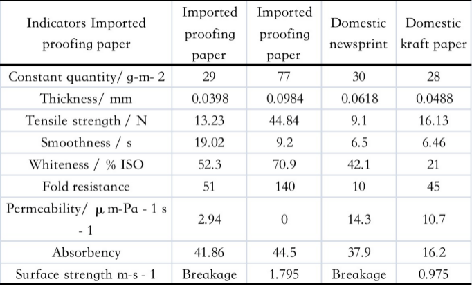
As can be seen from Table 5-1, with the exception of imported proof papers for inkjet printing, industrial transfer papers generally require a weight of around 30 g-m-2 , a tensile strength of 9-20 N, a smoothness of 5-20 s, a folding resistance of 50 and an absorbency of 40 g-m-2 . The analysis shows that the physical strength of the imported paper is relatively high, and the smoothness, whiteness and absorbency are good. This facilitates good contact between the ink and the paper during the heat transfer printing process, with a thick printing ink layer, resulting in a clear and rich transfer paper pattern with good visual effect and gloss.
In addition, the main influence on the quality of the printing paper is the finishing layer on the surface of the printing paper (i.e. the release agent, as shown in Figure 5-1), which improves the printability [137] (the paper has a suitable affinity with the ink and can be peeled off quickly at high temperatures and pressures) and does not change any of the appearance or serviceability of the non-graphic areas of the original fabric at high temperatures and pressures. The effect of thermal transfer can be improved by improving the appearance or serviceability of the non-patterned areas of the original fabric, and may therefore be a priority in future research.
5.4.2 Field density study of thermal transfer printed paper
Density [138][139] is an important form of colour evaluation and is used by printers to determine whether the ink quantity needs to be increased or reduced. In four-colour printing, the most important thing is the balance between the densities of cyan, magenta and yellow, otherwise the two colours will be overprinted with a bias. As an important parameter in evaluating the quality of a print, field density is defined as 100% coverage of the screen area on the printing plate, i.e. the part of the print that is completely covered by the ink layer, measured with a reflectance densitometer and expressed as Dv. According to the definition of reflectance density (5-2).
Dv = lg1 ÷ β (β indicates the reflectivity of the ink layer to light) (5 – 2)
The X-rite 528 spectrodensitometer was selected to measure the reflectance density of the sample. The results were compared with the standard gravure print field densities. The printing densities of the proof sheets are shown in Tables 5-2 and 5-3.
Analysis of Table 5-2 and Figure 5-22 shows that the highest density range of printing that can be reproduced on transfer paper is: Y: 0.5 to 0.7; M: 0.8 to 0.95; C: 0.8 to 0.9; K: 1.15 to 1.25. The densities obtained on normal printing paper range from: Y: 0.85 to 1.1; M: 1.25 to 1.5; C: 1.3 to 1.55; K: 1.4 to 1.7. ~ From the above data, the density on the transfer paper is much lower and does not seem to meet the requirements of printing, however the transfer paper is only a medium and the end product is the printed colour on the fabric.
Table 5-2 Solid dendity of CMY K on proof paper

Figure 5-2 The relationship between the density of CMYK and dot percent on the prepare papers

5.4.3 Study of the density of printed matter on fabric
Analysing Table 5-3 and Figure 5-3, the highest densities obtained for reproduction printing on fabric after transfer range from: Y0.8 to 1.0; M1.4 to 1.55; C1.3 to 1.5; K1.5 to 1.75. The densities obtained on normal printing paper [1 50] Y: 0.85 to 1.1; M: 1.25 to 1.5; C: 1.3 to 1.55; K1.4 to 1.7. 1.7. When comparing the two figures, they are generally in the same range. The colour reproduction requirements are met according to the traditional evaluation criteria for print quality. Due to the nature of sublimation inks and the differences in the nature of the paper and the fabric, nearly the same amount of ink (no loss during transfer, i.e. complete transfer) has a different density. It is precisely the density on the latter fabric print that we require, so it can be seen that the density of the ink on the thermal transfer printing paper determines the density of the image on the final fabric.
Table 5 – 3 CMYK Quad Block Density on Fabric
Tab. 5 -3 Solid dendity of CMYK on fabric

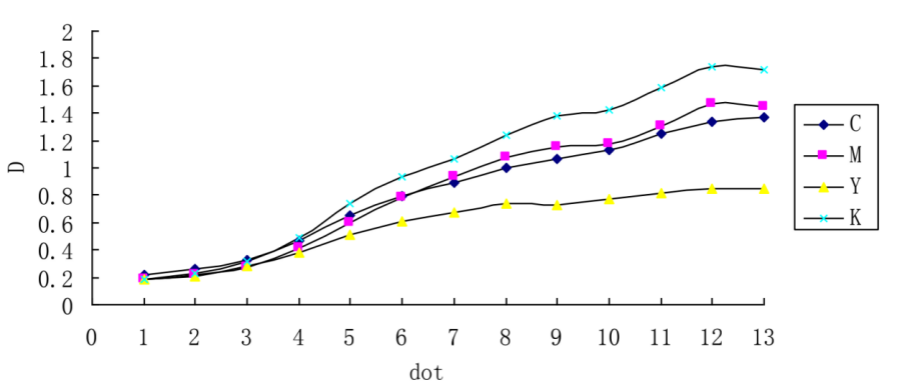
Figure 5-3 The relationship between the density of CMYK and dot percent on the fabic
Table 5-4 TSpecial solid dendity of common products

Table 5 – 5 Range of shadow dendity of lithgraphic products
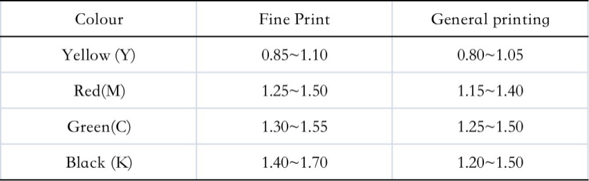
5.4.4 Transfer Printed Paper and Fabric Colour Gamut Study
The colour rendering effect of the inks on paper and fabric was evaluated using an X-Rite 528 spectrodensitometer to measure the primary and secondary densities of the CMY inks as shown in Tables 5 – 6.
(1) Colour intensity
When comparing the colour intensity [142] of different inks, the one with the highest density of the three complementary filters is the intensity of the ink, i.e. the master density. The colour intensity determines the saturation of the ink and affects the accuracy of the inter- and multi-colour hue of the set and the balance of the neutral colours.
Table 5 – 6 Dendity of CYM
(2) Colour phase error, greyscale, and colour efficiency
Inks with poor selective absorption of the spectrum due to impurity of colour produce undesirable secondary densities, resulting in chromatic errors. The magnitude of the secondary density is a response to this chromatic deviation. As can be seen from Table 5-7, the various primary colours can be measured with R, G and B filters to obtain three different density values of high, medium and low magnitudes, and the chromatic error can be calculated using the following equation (5-3).
Colour Shift = (DM – DL ) ÷ (DH – DL ) × 100% (5 – 3)
Greyscale, which is the grey content of a colour, is caused by the undesirable absorption of impurities in the ink and only serves to eliminate the colour, calculated using the following formula (5 – 4).
Grayscale = DL ÷ DH × 100% (5 – 4)
The greyscale has a strong influence on the saturation of the ink; the smaller the percentage of greyscale, the more saturated the ink.
Colour efficiency means that a primary colour ink should absorb 100% of one of the three primary colours and completely reflect the other two. The colour efficiency of an ink is reduced by the presence of undesirable absorption and insufficient absorption due to impurities in the ink, as calculated by the following formula (5 – 5).
Colour efficiency = 1 – (DM + DL ) ÷ 2DH × 100% (5 – 5)
(where: DL is the minimum density value, DM is the intermediate density value and DH is the maximum density value)
Table 5 – 7 Color error, color grey and colo r efficiencies of CMY on the heat transfer printing paper
Table 5 – 8 Color error, color grey and color efficiencies of CMY on the fabrics
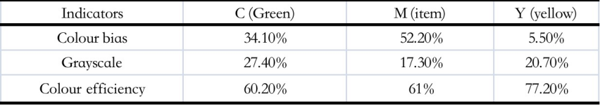
Table 5 – 9 Color error, colour grey of CMY on the special products
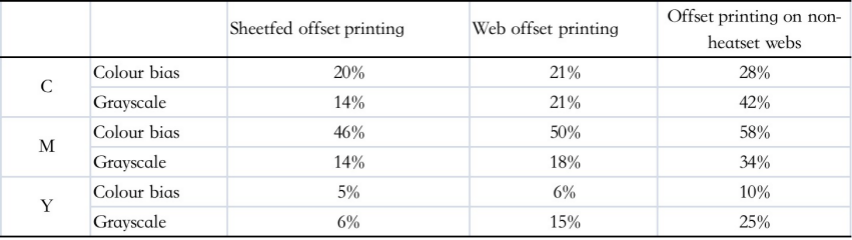
The measurement of colour shift and greyscale gives an indication of whether the colours of the proofs, inks and prints are uniform across a batch of prints. According to Tables 5-7 and 5-8, and by analogy with the colour shift and greyscale values of a typical print in Table 5-9, it was found that the colour shift and greyscale values of the three inks were high, while the colour efficiency was low. In comparison with the data in Table 5-7 and Table 5-8, it can be found that the colour shift and greyscale of the three primary inks are considerably lower, while the colour efficiency is significantly higher. The author’s analysis is that the thermal transfer printing paste is a very low viscosity ink and is not as effective as the mature resin-based inks. As the carrier of the heat transfer printing paste is a chemical fibre fabric, the absorption of the ink in the process of colour formation differs from that of the paper carrier; there are differences in the angle of concern for the reproduction of colour by different carriers.
(3) Colour gamut analysis

Figure 5 – 4 GATF colour wheel chart
1 – colour gamut of lithography ,2 – colour gamut on fabric,
3 – colour gamut on thermal -transfer printing paper
The GATF colour wheel chart, recommended by the Printing Technology Foundation of America, is one of the most common methods for analysing colour gamut. The colour gamut chart covers parameters such as grey scale and hue error of the ink and includes information on the hue, lightness and saturation of the three intermediate colours R, G and B and the three primary colours Y, M and C in the colour wheel chart. The GATF colour wheel diagram is based on the test values and can be compared with the classic horseshoe curve to determine the colour gamut of the print being analysed and studied.
The GATF colour wheel diagram, based on the experimental data in Tables 5-8 and 5-9, is shown in Figure 5-4. As can be seen, the outermost hexagon is the ideal colour gamut, with all the colours being standard colours and without colour phase errors or greyscale, defining a pure colour with 100% saturation. In practice, the colour gamut that can be reproduced is the gamut enclosed by hexagon 1 in Figure 5-4, which is the gamut that can be reproduced in standardised offset printing. In the heat transfer printing process, the colour gamut of the fabric print is significantly larger than that of the heat transfer paper in the print reproduction and heat transfer printing and almost coincides with that of the conventional offset printing. This means that the performance of the transfer paper as an intermediate carrier in the heat transfer printing process has a direct impact on the results of the fabric print. If the maximum reproduction of the colour gamut on the printing paper, the colour gamut on the finished fabric can also be maximised and the quality of the printing effect greatly improved.
5.4.5 Printing relative contrasts
The relative print contrast K is an important basis for controlling density and dot gain in the printing process [145]. The relationship between K-Ds is quantified through theoretical derivation and design of experiments to test the printing control parameters; the range of values for field density and K is clarified. This chapter is devoted to the study of the phenomenon of relative contrast in the printing of heat-transfer print samples, which is of interest for the production of heat-transfer printing.
(1) Theoretical analysis of the relative contrast of printing
Equation (5 – 6) is calculated as
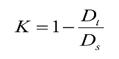
(where Dt is the density in 75% of the area; Ds is the field density)
The formula for calculating the relative contrast of printing was developed by the German Printing Research Association. This formula reflects the intrinsic link between print field density and dot gain.
It can be seen from the formula (1) that if Ds is fixed, the smaller the Dt, the larger the K value, which means that the greater the image contrast, the smaller the dot expansion; conversely, the larger the Dt, the smaller the K value, which means that the smaller the image contrast, the larger the dot expansion. Therefore, the K value is an important basis for controlling field density values, dot density and dot gain in the printing process.
Marvel-Davis formula: a = (1 – 10 – Dt) / (1 – 10 – Ds) (5 – 7)
(where a is the area of the network as a percentage; Dt is the density of the network area; and Ds is the field density.)
Reveals the relationship between density and dot value. The dot gain is calculated by calculating the percentage of dot area in the printing area.
Analysis of formula derivation
For (1)(2) the formula is deformed to give
From (1) we have Dt = Ds* (1 – K) ①
From (2) we have 1 – a* (1 – 10 – Ds) = 10 – Dt
lg[1 – a* (1 – 10 -Ds) ] = -Dt ②
Ds* (K- 1) = lg[1 – a* (1 – 10 – Ds)] from ①②
K= lg[1 – a* (1 – 10 – Ds) ]/ Ds + 1
K={ lg[1 – a* (1 – 10 -Ds) ]+Ds} / Ds
limDs → 0K= limDs → 0{ lg[1 – a* (1 – 10 -Ds) ]+Ds} / Ds ③
Yes (3) Mathematical derivation: Lopita’s Law
limDs → 0K= limDs → 0 – a*10 -Ds ln10 / [ 1 – a* (1 – 10 -Ds) ]*ln10+1 limDs → 0K= limDs → 0 a*10 -Ds / [a* (1 – 10 -Ds) – 1] + 1
When Ds → 0, we have 10 -Ds → 1 a*10 -Ds / [a* (1 – 10 -Ds) – 1] + 1 → – a So limDs → 0K = 1 – a
When Ds → 0, we have K = 0.25 when the network coverage a is 75%
When Ds = 2, K = 0.70538
When Ds → ∞, we have K = 1
Twelve overprints were taken in descending order from the overprints; ten finished samples were randomly selected. The overprints and print samples were tested with a spectrophotometer at a field of view of 10º, a temperature of 18°C and a relative humidity of 46%. The data for the weak colour yellow Y are shown in Tables 5 – 10; the data for the strong colour magenta M are shown in Tables 5 – 11.
Table 5 – 10 Value of K and the corresponding increase in the value of dots on the yellow and magenta print of the test paper

Table 5 – 11 Value of K and the corresponding increase in the value of dots on the yellow and magenta print of the test paper
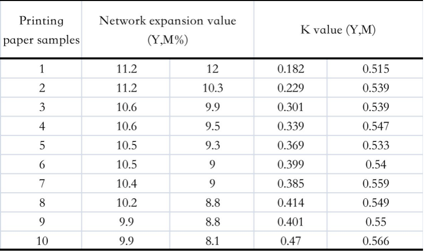
(2) Analysis and discussion
As derived from the equation in (1) above, K should theoretically be in the range [0.25, 1]. The current view is that K should be taken between [0 and 1].
When the ink layer is very thin, the field density Ds → 0 and 75% of the area can be printed, which is then taken into account in the derivation ⑤ where K = 0.25.
When Ds → ∞, K = 1 can be calculated from the above derivative formula; this mathematical value has no physical meaning, because at this point the nets in the 75% area have already gone off the grid and become the field, which has no practical meaning in printing production; the a in the derivative formula changes at this point, so the relationship between K and Ds becomes dynamic, taking into account the change in a as the field density increases.
According to the actual situation of printing production, the limit state in printing is when Ds=2, which is taken into account in the above derivation formula and calculated as K=0.70538; when the field density ≥2, the ink layer thickness is too large, at this time the net the rate of inking is greater in the dotted part than in the field, at which point K begins to show a downward trend. Therefore, the K and Ds curve is an empirical curve of the above relationship, with a complex functional relationship. It should be written as
K = { lg[1 – a* (1 – 10 – Ds) ]+ Ds} / Ds (for Ds ≤ 2)
From the data in Table 5 – 10, the relationship between the overprinted sample K and the mesh expansion is plotted as shown in Figure 5 – 5.

Fig. 5 – 5 the relationship between K and dot gain of Y on the wasted printing papers The relationship between K and dot gain of Y on the wasted printing papers is plotted from the data in Table 5 – 11 as shown in Fig. 5 – 6.

Fig.5-6 the relationship between K and dot gain of M on the wasted printing papers
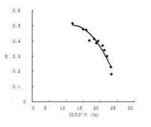
Fig. 5 -7 the relationship between K and dot gain of Y on the printing proofs
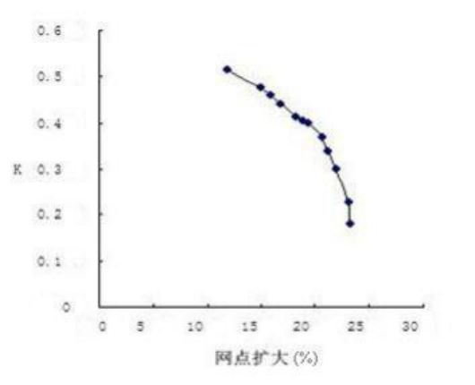
Figure 5 – 8 the relationsh ip between K and dot gain of M on the printing proofs
A maximum of ≤15% of the maximum mesh expansion value is specified in the print. Therefore, a compromise between the two results in the best density in the field. The author has carried out an experimental analysis, as shown in Figures 5-7 and 5-8, where the K value for the weaker colours yellow is between 0.3 and 0.4 when the enlargement of the dot is less than or equal to 15%; for the stronger colours M, the K value is between 0.45 and 0.6 when the enlargement of the dot is less than 15%. This corresponds perfectly to the finished sample in printing practice.
The relationship between K and field density Ds, as described in the current literature, is shown in Fig. 5-9 and is considered to be the field density calibration value for the colour when the relative contrast reaches a maximum value of Kmax.
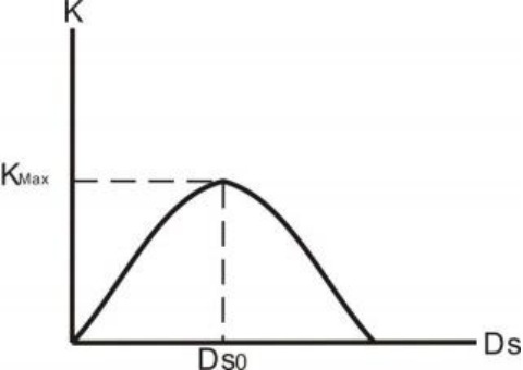
Ds
Figure 5 – 9 the curve of K and Ds
Based on the above derivation and test data from production practice, I believe that the Kmax – Ds curve should be as shown in Figure 5 – 10; the field density to be selected is not the field density when Kmax is taken to be the maximum, but the actual dot gain value during printing should be taken into account.

Printed field density
Figure 5 – 10 Correlation between print relative contrast and print field density
Fig.5 – 10 the curve of K and Ds
(3) Conclusions of the theoretical analysis
a . K is taken to be in the range [0.25 , 1].
b. The field density should be determined from the K value, taking into account the expanded value of the mesh, which should be less than or equal to 15%, which corresponds to the best density in printing practice.
c. The relationship between K and Ds is shown in Figure 5 – 10.
(4) Heat transfer Printed proofs Printed relative contrast analysis
The X-Rite 528 spectrodensitometer’s print contrast function was used to directly measure the eight colour blocks on the transfer paper samples and the fabric samples to obtain the relevant densities and the corresponding print contrasts, as summarised in Tables 5 – 12 and 5 – 13.
The higher the K value, the better the field density of the print. In order to improve the thermal transfer, the field density and the K-value have a corresponding relationship. When the ink volume is too high, the field density increases, the dot increases or even glues the plate, and the K-value decreases. Levels and clarity are compromised. If the ink volume is too small, the field density is low and the K-value also drops.
The maximum K value corresponds to the field density value that can be used to establish the grey balance and tone curve calibration for transfer printing plate separation. The maximum K value and the data on colour shift, greyscale and colour efficiency are fed back to the plate making process as a basis for setting the neutral grey balance and the three-primary stencil settings.
The analysed K-values and field density values are the main data standards for data management and standardisation and quality control, and can be used as a basis for controlling the quality of printed images.
Many factors influence the print contrast, mainly the type of paper and the thickness of the ink layer. It is important to find the maximum relative print contrast value as the percentage of dot area increases to the minimum and the ink layer thickness on the transfer paper reaches its optimum value when the printing pressure is stable and the printing process is suitable for the printing operation.
Table 5 – 12 K of heat transfer printing paper
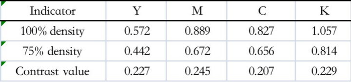
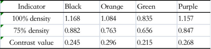
Table 5 – 13 Print Contrast on Fabrics
Tab.5 – 13 K of fabric
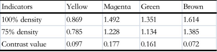
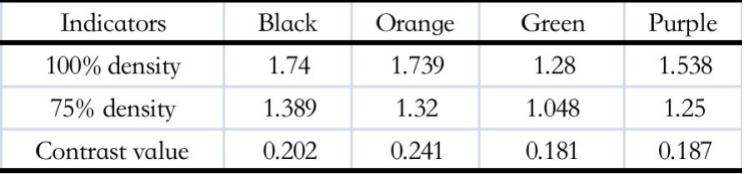
The relative contrast values recommended in our printing industry standard CY/T5 – 1999 are shown in Table 5 – 14.
Table 5 – 14 Relative contrast values recommended in the printing industry standard CY/T51999 Tab.5 – 14 K of CY/T51999
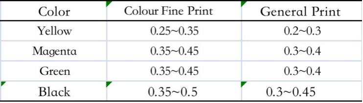
According to the analysis of the heat transfer prints, the relative contrast range was found to be between [0.25 and 1], and in production practice it was found that the customers were satisfied with the colours of the printed and transferred prints within this range.
Compare the sample and fabric with the offset printing industry recommended printing contrast value, can be found, the sample and fabric on the printing contrast far from the recommended value range, and the sample on the printing contrast value than the fabric on the contrast value is a little larger, printing contrast value (K value) in 0 ~ 1 between the variation, and the larger the K value, that the dot density and field density ratio is smaller, the dot increase value is also smaller. The larger the K value, the smaller the ratio of dot density to field density and the smaller the dot gain. This indicates that the dot gain in the sample and fabric is large and needs to be strictly controlled. In order to verify that the dot gain is not severe, the following discussion was conducted.
5.4.7 Node-increasing values
Printing and printing process, because of the role of pressure, dot increase [149] [150] in is unavoidable, but to control within the permissible range, the national standard stipulates that theoretically 50% of the regional dot expansion to less than 15%, the actual production of dot expansion is less than 20% that can be. Otherwise, the printing quality will be seriously affected and the contrast will be reduced low, darkening of the image, blurring of the mesh and causing colour changes.
Dot gain is divided into mechanical dot gain and optical dot gain. The mechanical dot gain is the result of printing pressure, which causes the dot on the paper to expand outwards, making the dot on the substrate larger than the dot on the printing plate; the optical dot gain is a visual phenomenon formed by the light absorption of the ink, the penetration and absorption of the ink into the paper and the light scattering of the ink by the porous structure of the paper. In practice, mechanical dot gain can be reduced by changing the printing conditions. In this study, the main focus is on the mechanical dot gain of thermal transfer paper.
The dot gain value ZD is the difference between the dot coverage FD in the study area of the print and the corresponding dot coverage FF on the original. The dot gain is calculated using equations (5 – 7).
ZD = FD – FF (5 – 7)
Using the Murray – Davis formula (5 – 8), the network coverage can be calculated as follows.
FD = (1 – 10 – Dt ) ÷ (1 – 10- Ds ) (5 – 8)
(Dt represents the density value at any network point and Ds represents the field density value)
Table 5 – 15 Nets on Printed Paper Increases
Tab.5 – 15 D ot gain on the heat transfer printing paper

Table 5 – 16 Increase in mesh on fabric
Tab.5 – 16 D ot gain on the fabrics

In this experiment, the dot gain function of the X-Rite 528 spectrodensitometer and the CC-dot, which is a special instrument for measuring dot gain, were first used to measure the paper and fabric samples. The dot gain values were calculated using the formulae and tabulated in Tables 5 – 14 and 5 – 15.
According to Data Sheet 5 – 14 and Table 5 – 15, the corresponding graphs are obtained in Figures 5 – 11 and 5 – 12 respectively.
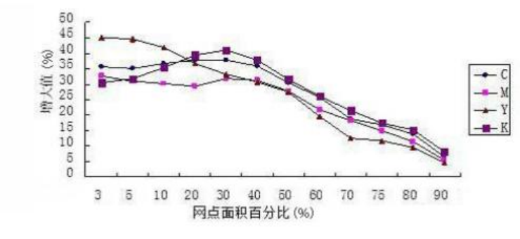
Figure 5 – 11 the dot gain curve of CMY K on the heat transfer printing paper

Fig. 5 – 12 the dot gain curve of CMY K on the fabric
As can be seen from Experimental Data Table 5-15, Table 5-16, Fig. 5-11 and Fig. 5-12, the brighter areas on the printed paper and fabric have a somewhat larger mesh, while the darker areas are better. This also confirms the reason for the smaller K values. The causes of dot gain are varied and require adjustment of printing parameters such as printing pressure, printing speed, etc. It may also be a problem with the paper, e.g. its permeability and absorption properties, or with the nature of the ink, as sublimation-type thermal dispersion inks are generally low-viscosity inks and are susceptible to dot gain when exposed to high temperatures. Figure 5-11 compares with Figure 5-12 and finds that the values of dot gain for the four inks on the thermal transfer paper vary, but the trend is the same; while the values of dot gain for the four colours obtained on the fabric are surprisingly consistent.
5.5 Summary of this chapter
The following conclusions were obtained from the experiment.
(1) In the industrial production of thermal transfer printing, the whiteness of the thermal transfer printing paper is not too high requirements, only the thermal transfer process intermediate carrier, as long as the paper properties required to meet the general printing process can be, the focus and special requirements are that it must have a high degree of smoothness, high temperature and high pressure, and in high temperature and high pressure ink sublimation easy to separate.
(2) heat transfer printing paper printing field density requirements than the traditional printing field density, basic control in Y: 0.5 ~ 0.7; M: 0.8 ~ 0.95; C: 0.8 ~ 0.9; K: 1.15 ~ 1.25 range can be obtained higher quality fabric products Y: 0.8 ~ 1.0; M: 1.4 ~ 1.55; C: 1.3 ~ 1.5; K: 1.5 ~ 1.75. 1.5~1.75.
(3) Heat transfer printing paper Printed products and fabrics do not require high colour efficiency and colour intensity of the printing paste. Due to the relatively large value of dot expansion, resulting in printing contrast values than conventional paper printing to obtain the contrast value of small. The printing contrast is generally controlled for heat transfer printing paper Y: 0.2 ~ 0.25; M: 0.25 ~ 0.3; C: 0.2 ~ 0.25; K: 0.2 ~ 0.25. Fabric Y: 0.1 ~ 0.15; M: 0.15 ~ 0.25; C: 0.15 ~ 0.2; K: 0.15 ~ 0.2. Although the result is a small contrast value, but from a visual point of view the image quality is still The results are relatively good.
(4) The range of colour reproduction of heat transfer printed fabrics is basically the same as that of conventional four-colour printing the scope of the domain.
6 Study on the blending of spot colours in printing pastes for high temperature thermal transfer printing paper
6.1 Introduction
6.1.1 Background of the study
With the continued development of the printing and packaging industry and the increasing market share of gravure printing, especially the application of heat transfer printing in the textile industry, four-colour ink overlays are no longer sufficient to meet the requirements of the market, and spot-colour inks [151] with their stable hue can ensure the accuracy of colour transfer, specificity, field, opacity and the performance of a wide colour gamut and other characteristics increasingly reflect its superiority. This is particularly true for textiles, where the use of spot colours can avoid the appearance of “clashing”. The use of spot-colour ink can reduce the number of printing plates, the effective use of residual ink, reduce the number of printing, thus saving costs; in addition, in the market of many branded products, spot colours can best reflect the unique brand characteristics of the product, which plays a good role in promoting the advertising role of enterprises and anti-counterfeiting, in the current heat transfer printing industry for the pursuit of personalisation more and more, so spot colour matching in the heat transfer printing This is why colour matching is so widely used in heat transfer printing.
6.1.2 Study content
The ink formulation is based on the monotype equation and provides a reference for the ink formulation of high temperature thermal transfer printing.
6.2 Ink blending mechanism
6.2.1 Theoretical basis for spot colour ink blending
Coloured ink blending in the printing industry is used in three main ways: manual colour matching, mechanical colour matching and computerised colour matching. Nowadays, a combination of manual and computerised ink blending is commonly used. Regardless of the form of ink blending, several theories are followed. The main focus is on the following areas: database search methods, K-M theory, neural network colour matching, Nürnberg equation colour matching and other colour matching methods.
(1) Database search method
The database search method is a way of finding the closest colour to the target colour in the database, based on the colour values of the target colour, in order to determine the formula. The advantage of this method is that the principle is relatively simple, but the number of ink blocks that can be matched is limited by the size of the database, which is a huge undertaking to build. When new colours are added, only approximate recipes can be obtained from the colour data in the database and then added empirically.
Point S used a database approach to design a colour matching system [152], which covers a wide range of colours and can model a wide range of colours in the database, but when the ink system is slightly changed, the colours matched have a large colour difference. The data is available for all three attributes of colour. Under different light sources, the differences between the three attributes of the colour to be matched and the three attributes of the stored colour are calculated to find the closest match to the colour in the database and to determine the best formula. The disadvantage of this colour matching system is that the accuracy of the recipe is low when the triplet properties of the sample colours differ significantly from those in the database. A common problem with the database search method is the need for a comprehensive database and the amount of work involved.
(2) K-M theory of colour matching
The K-M theory [153] originated in the 1930s and was based on a number of assumptions, with some shortcomings. The K-M theory was developed in the 1930s on the basis of a number of assumptions and had certain shortcomings.
The Macbeth ProPalette colour matching system is based on the spectral colour matching method and applies the relevant theories, such as the theory of turbid media, the theory of multiple luminous fluxes and the theory of transparent media. The models can be used for colour matching of inks and coatings to reduce the degree of homochromaticity and improve the accuracy of colour matching.
Robert T. Marcus proposed an iterative colour matching model in which parameters such as the homochromatic index, the colour difference and the spectral curve are assigned a weighting ratio to create an objective function, and the user determines the weighting ratios of the different parameters according to his needs and selects different objective functions to reduce the workload and improve the efficiency of colour matching.
Chen Yaxiong and Jin Lan took the effect of ink thickness on colour into account, using the modified K-M theory as the basis for their model, using spectral and three-stimulus approximations. The model has a low accuracy for colours with high or low lightness and saturation.
The mathematical model of colour matching for offset printing inks was developed by James Liu. The model uses the K-M theory of double constants and three stimulus values. However, the model is complex and the accuracy of the colour matching is low and cannot meet the needs of actual production.
Gao Hu has established a colour matching model for spot colour inks for gravure printing, based on a modified K-M theory combined with a three-stimulus colour matching method, with a colour accuracy of within 5E*AB, which meets the requirements of general printing accuracy, but does not meet the requirements of high-end printing.
Zhou Chunxia and Tang Zhengning have developed a colour matching model based on three base inks with three stimulus values matching based on the K-M single constant equation. The model was only theoretically investigated for the matching of spot colour inks in packaging printing, but was not validated for practical printing.
The K-M theory has been used as the basis for the colour matching models mentioned above. The modified K-M theory can improve colour matching accuracy to a certain extent, but the calculations are more complex and the colour rendering properties of the ink could be improved. More importantly What is important is that it is generally more difficult to achieve in production practice.
(3) Neural network colour matching method
Artificial neural networks [154] are more powerful in terms of data processing and have similarities to the human eye in terms of colour, with non-linear mapping capabilities to simulate the human eye colour matching process. There is currently no suitable neural network colour matching model for colour matching systems, and this model does not meet the requirements of practical applications.
Stephen Westland et al. propose a colour matching model for offset inks based on ANN-KM with a three-layer MLP neural network. A new approach to ink colour matching was developed by applying the mapping between neural network vectors. The ANN model has a colour difference of 8.23 NBS, which does not meet the requirements of fine print quality.
(4) Colour matching based on the Nünchberg equation [ 155 ]
The Nürnberg equation is an equation that converts the three stimulus values and the percentage of dot area into each other. The Nürnberg equation is based on the assumptions of both the white area element and the original colour value of the printed colour, but in practice it is difficult to match the ink due to the many reproduction conditions in printing.
A three-colour flexographic colour presentation model was developed by Jian Feng, and an application software was developed. The Nürnberg equation was corrected by regression, the samples were printed under the same printing conditions, and only three colours were studied, as opposed to four colours in practice.
Zheng Yuanlin has developed a mathematical model for colour presentation in four-colour flexo printing, based on a modification of the Nünchberg equation.
The colour difference is controlled to within 6 NBS and no further consideration is given to other printing methods, which are limited in their application.
The Nürnberg equations were developed by Luenin and modified by the exponential, dot-expansion and regression methods. The mathematical model was developed by taking into account the above parameters. The mathematical model was developed taking into account the above parameters. It provides a theoretical basis for colour matching in printing, but has not been verified in practice.
(5) Other colour matching methods
Many scholars have studied the colour matching of inks. Zhao Chenfei used tetrahedral interpolation and a three-dimensional look-up table to develop a colour matching model for ink based on three-spin radical colour matching. The limitation of this method is that it is only applicable to the same paper, ink and printing conditions as the chromatographic printing.
Qianqian Guo combines spline interpolation and chromaticity theory to develop a colour matching model for inks in a two-dimensional colour space based on a database search method. The model is database dependent and the accuracy of the formulation is influenced by the accuracy of the database.
At present, the most commonly proposed ink-matching models include the multi-pass method, the optimisation factor method, the hybrid shaping approximation method, the recursive quadratic approximation and optimisation method, the Sanderson correction method, the matrix blocking method, the universal colour system model, the absolute colour-matching technique method and the non-convex approximation method. However, most colour matching software is still based on the K-M theory, but the K-M theory takes into account the properties of the ink in a rather partial way, so these colour matching models are not as effective as the K-M theory Deviations can occur when determining the ink formulation.
A number of foreign research institutes have also been working on automatic colour matching systems, and some results have been achieved. Since the 1980s, there has been an increase in the number of testing instruments used to determine colour properties, and since the 1990s, the rapid development of advanced technologies and theories has led to more than 5,000 industrial computerised colour matching systems. Some of the domestic and foreign colour matching instruments and software are shown in Table [156] 6-1 and Table 6-2.
Table 6 – 1 Foreign computerised colour matching hardware and software
Tab.6 – 1 Hardware/software colour matching at abroad
Since the 1990s, many scholars in China have conducted in-depth research on colour matching theory and have achieved fruitful results. The first Chinese colour matching software in China, SRICI, was launched by the Shenyang Chemical Institute.
The application range covers dyestuff, printing and dyeing, ink and other colouring related industries, with a large economic
The benefits. In addition, many institutions in China have developed colour matching systems, some of which are shown in Table 6-2. Table 6-2 Domestic colour matching systems
Tab.6 -2 colour matching system at home

6.2.2 Features and colouring mechanisms of spot inks
(1) Spot colour ink characteristics
For colour printing, CMYK four-colour inks are commonly used. In order to achieve a particular anti-counterfeiting effect, etc.
The result is that spot colour printing can be used to compensate. Spot inks [157][158] refer to the fact that spot inks are specific coloured inks that are mixed with four YMCK inks in a certain proportion, rather than being overprinted with four CMYK colours, and that each spot colour is printed on a separate plate. Each spot colour has its own fixed hue, which ensures accurate colour reproduction in print and addresses individual printing requirements. Most spot colour inks have a high opacity and are opaque and can be used for field printing.
a. The colours that appear on the screen on a computer are often not what you see is what you get. This is not fully reflected in printed matter. The colour gamut of spot inks is larger than that of CMYK four-colour printing inks, so in order to extend the range of colours visible beyond the print ink gamut on printed products, the use of spot inks for printing allows for colour
The domain is complemented by the
b. Four-colour printing ink density is generally only about 1.6 to 1.7, often lower than the density of the original. The density of the ink can be compensated for by spot colours, and the spot colours are mostly printed on the field version, which does not produce the phenomenon of moiré stripes.
c. Spot colours can be used to fulfil special needs such as fluorescent colours and metallic colours that cannot be achieved with four-colour printing. Nowadays, packaging products are becoming more and more sophisticated and personalised, and many special effects can be achieved only through spot colour printing.
d. Good for fine reproduction of small dots. When printing small dots with four-colour inks, it is easy to get a flat, large area of colour with a full set of spot inks. In addition, spot colours are sometimes used to enhance the fineness of the image in order to highlight fine text.
e. In security printing, security inks such as spot inks are often used to achieve a security effect. In packaging printing, spot-colour inks are used to ensure colour consistency in the printed product. In map printing, spot colours are often used extensively in order to reproduce the desired special colours.
(2) The principle of spot colour ink presentation
The colouring of spot inks is based on the principle of subtractive colour mixing. The principle of colour rendering of spot inks is illustrated by mixing magenta and cyan inks in equal proportions. Figure 6-1 shows the principle of the absorption and reflection of light by the two inks when they are mixed in equal proportions and printed on paper.
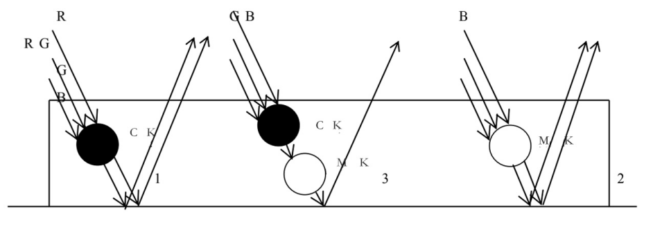
Figure 6 – 1 Color rendering of spot color ink
In mixed colour inks, the three cases 1, 2 and 3 shown in Fig. 6-1 should be present at the same time, when white light is shone, the cyan ink (1 in Fig. 6-1) is minus red, i.e. W-R=G+B; the magenta ink (2 in Fig. 6-1) is minus green, i.e. W-G=R+B: and when the light beam is shone on the cyan and magenta ink particles at the same time, because the inks are mixed on the premise that no chemical change has occurred, the object absorbs and reflects the red and green light at the same time, i.e. W-R-G=B. When all the reflected light is incident on the human eye, the retina is stimulated by the same light.
The cone of colour-sensitive cells is statically mixed to form a mixture of colours, i.e. 3W -2(R+G)=(R+G+B)+2B=W+2B, and the eye sees the colour blue in the ink. The whole process of colour presentation is a subtractive mixing followed by an additive mixing process.
6.2.3 The ink blending process
(1) Analyse the colour composition of a given target colour in order to determine the required ink ratio and the type of washout agent.
(2) Mixing of small samples. In accordance with the ratio in (1), a small amount of the original ink is first used for adjustment, while a small portion of the blended ink is diluted to the required level for printing, and a small colour sample is made on the paper sample using an IGT suitability meter for comparison with the original. When the colour sample meets the requirements of the original, a large batch is mixed.
(3) Keep a record of the proportion of each colour of ink used for blending, the type and brand of ink, etc. for reference.
On the basis of the above, a search of the literature has revealed that there are no reports of heat transfer printing paste blending based on the theory of the monotype equation. This chapter explores the use of the monotype equation as a basis for ink proportioning.
6.3 Inking theory based on the equation theory of masking
6.3.1 Masking equations
The monotype equation [159][160] is based on the assumption that the proportionality and superposition of ink densities holds. The secondary densities Dr, Dg and Db of the red, green and blue filters at any point on the print, and the primary densities of the cyan, magenta and yellow inks (i.e. the densities under the complementary filters) C, M and Y, satisfy the monotype equation.
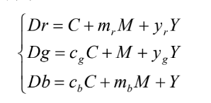
cg and cb are the ratio of the density of cyan ink under the green and blue filters to the density under the red filter, mr and mb are the ratio of the density of magenta ink under the red and blue filters to the density under the green filter, yr and yg are the ratio of the density of yellow ink under the red and green filters to the density under the blue filter, respectively.
The solution to the equation is

where: X 1 – Mb Yg – Cb Yr – Cg Mr + Cg mMb Y r + C b Yg Mr
This equation is the final form of the masking equation, which represents the amount of ink (expressed as a principal density) in C, M and Y in real life and can be achieved by photomontage. The coefficients in brackets indicate the percentage of masks at a given density and the coefficients outside of brackets indicate the slope of the tonal curve when the masks are superimposed. The amount of C, M and Y ink required to reproduce the colour can therefore be calculated from the masking equation based on the values of Dr, Dg and Db.
6.3.2 Linear regression for colour matching models the monotype equation is based on the assumption that the proportionality and superposition of ink densities holds, so that we can derive the principal density of the three primary inks and the density of the red, green and blue filters at any point on the print.
The linear relationship between the degrees Dr, Dg and Db is as follows.

This equation is the colour matching model for this experiment. In this equation, Dr, Dg and Db are the densities of a spot colour under the three RGB filters, and C, M and Y are the principal densities of the ink volumes of the three primary colours, cyan, magenta and yellow.
b1, b2, b3, k1, k2, k3, l1, l2 and l3 are the regression coefficients.
After the monotype equation mathematical model, the coefficients of the colour matching mathematical model were determined. In this paper, the data from the standard colour spectrum was collected as a sample for modelling, and the LINEST linear regression function was used to find the linear regression coefficients using the data analysis option of the EXCEL office software.
Once the regression coefficients have been determined, a C++ programming language is written and the desired colour scheme is obtained by entering the density values for the Dr, Dg and Db filters.
6.3.3 The Yul-Nielsen formula
For the calculation of the reflective dot area rate of printed matter, it is first assumed that the ink printing dot absorption density is infinitely large, while the blank part of the substrate is all reflected, the reflectivity is (1 – a). As a result of the actual print ink absorption density, ink thickness, by the paper and colour and other factors, so that the printing ink field density Ds is usually only 1 to 1.6. Therefore, the reflective dot density of the print will be affected by the field density Ds Impact.
If, for any cluster of outlets, the product rate.
The reflective density Dt can be measured and converted to the mesh surface of the print

(6 – 4)
Where: a – the dot area ratio of the measured print
Dt – Mesh density of reflection of the measured print
Ds – the field density of the measured print
This formula is the general formula for the conversion of dot area ratio and dot density and is known as the Murray-Davis formula.
Youell and Nelson introduced a compensation scheme based on the above, taking into account the effect of photo-permeation on paper.
The correction factor n, which gives the Yul-Nelson formula, is

where n is called the Yul-Nelson factor , and n is to be determined experimentally.(
6.3.4 Printing chromatographic colour matching
The ink colour scheme follows the same pattern as the trichromatic dots. Each colour block in the chromatogram is marked with a percentage of the area of the primary dots, and these values can be used to determine the proportion of trichromatic content in the original colour sample.
For example, a light red colour formed by a standard colour sample and 40% magenta dots is calculated as follows: M:W = 40%: (100% – 40%) = 40% : 60% = 2:3
6.3.5 Colour difference evaluation methods
Both ISO and our national colour assessment measurements and colour difference analysis are based on the CIEl976L* a *b* colour space. The colour space is a homogeneous colour space with a clear relationship between the colour coordinates and the visual perception of the colour of the human eye. The advantage of this homogeneous colour space is that when the difference between two colours is greater than the recognition threshold of the human eye and less than the difference between two adjacent levels in the Menzel system, the psychological perception of the colour of the object is better reflected and the conversion equation to the CIE1931XYZ colourimetric system is as follows

Where X, Y and Z are the tri-stimulus values of the sample colour and X0, Y0 and Z0 are the tri-stimulus values of the CIE standard illuminant. l* is the mental luminance and a* and b* are the chromaticities representing red-green and yellow-blue.
In the CIEl976L* a *b* homogeneous space, the formula for colour difference [ 164 ] is as follows

L* is the difference in brightness between the two sample colours; a* and b* are the degrees of colour difference.
CIEl976L* a *b * Uniform colour space is used as a prerequisite for this thesis and the above equation is used as a metric for the calculation of colour difference.
The national standard states that when the colour difference of a print is less than 5-6 NBS it is a general print and less than 4-5 NBS is a fine print. Colour differences in the laboratory using Pantone chromatography range from 10 to 20 NBS.
6.4 Modelling the equations for spot ink colour matching masks
6.4.1 Experimental content
(1) Experimental equipment: X-Rite 528 reflectance densitometer, No. 3 Zeon cup, X-key software
(2) Experimental material.
a. A standard sample from the proofing workshop of a heat transfer printing company [165][166]. ECI2002 blocks are printed. The ECI2002 colour block must not be hydrographic and the overlay must be uniform. The gradation of colours from 1 to 100 must be minimised to minimize the spot area. Generally, the spotting zone is between 80 and 75. When proofing, attention should also be paid to the direction of printing and to the integrity of the ECI blocks.
b. Standard inks.
(3) Experimental methods
a. Using a large beaker, measure the ink and pour it into the stirrer.
b. Pour an equal proportion of ink blending oil into the blender.
c. Add the appropriate amount of thinner and mix
d. Use a cup (generally choose cup No. 3 for fast measurement) to completely invade the ink stirred well for about 2 minutes, lift it vertically quickly and press the stopwatch at the same time, wait until the cup flows out of the mouth in drops (not continuously) and stop counting quickly, control the viscosity between 19-23 seconds, if it is cup No. 2 between 60-75 seconds. If the measured viscosity is too high by a large number of seconds, repeat the above procedure until it passes.
e. Once the proofs are ready, a densitometer is used to measure the density of each colour gradation of the monochrome ruler for detailed recording, as a basis for future colour management data and for the EFI to generate a reference overview file.
f. In general, the standard inks are chosen to be washed out by half, because there is a difference in saturation between the print and proof sheets (regardless of the ink chosen), so we have to wash out half to simulate the saturation of the printer, so that it matches the sample printed by the printer. Secondly, this allows a certain range of adjustment of the colour shades in the actual print. However, the washout half is not absolute and can be adjusted appropriately as long as the standard and timely inspection work can be done. Some brands of ink (some alcohol-soluble inks) are not very concentrated in the original ink, and if they are washed out by half, the sample will not be very saturated and the colours will not be vivid, so we can reduce the proportion of washes to ensure the best saturation. The viscosity should be controlled between 19-23S in cup 3, which is the appropriate viscosity range for the proofer.
g. Colour management should be carried out each time a new standard ink is blended, and the standard sample should be measured with a densitometer and compared with the standard data. The viscosity of the ink should be controlled to (cup 3) ± 1 second and the density in the field should not exceed
± 0.15 Due to the colour differences between the inks, there are also colour differences between the standard inks in each blend. A detailed record of the ink ratios and viscosities is kept.
(4) Experimental data.
a. Using a reflectance densitometer, measure the density of the Y, M and C strips of the test plate at 10%, 20%, 30%, 40%, 50%, 60%, 70%, 75%, 80% and 90% of the grid area and record the data
b. Analyse the data to calculate the coefficients of the masking equation
c. Use a reflectance densitometer to measure the densities of field Y, M and C on the test plate respectively
d. Calculate the density of the three primary inks for a given colour block from the monotype equation, then take the Yul-Nelson equation to calculate the percentage of dot area for the three primary colours, calculate the ink proportion and analyse the accuracy of the results
6.4.2 Analysis of test data
(1) The test data records are shown in Table 6 – 3.
(2) Determine the coefficients of the mask equation. a. Find the coefficients of Y ink
Use a densitometer to measure the density at 10%, 20%, 30%, 40%, 50%, 60%, 70%, 75%, 80% and 90% on the Y test strip.
Table 6 – 3 The ratio of Y density between the red,green filter and blue filter
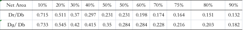
Calculate from Table 6 – 3, yr=0.2943, yg=0.3407
Measured with a densitometer M on the test strip
10%,20%,30%,40%,50%,60%,70%,75%, 80%,90% density.
Table 6-4 The ratio of m density between the red, blue filter and green filter
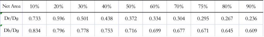
From Table 6 – 4 mr = 0.4076, mb = 0.7178
c. Find the coefficient of C Ink
10%, 20%, 30%, 40%, 50%, 60%, 70% on C test strip measured with a densitometer 75% , 80% , 90% density
Table 6 – 5 The ratio of m density between the green, blue filter and red filter
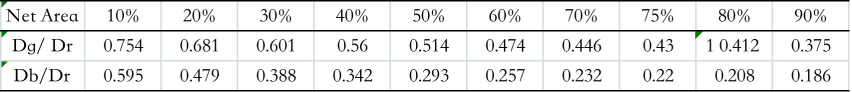
From Table 6 – 5 cg = 0.5248, cb = 0.32
(3) Measured field densities of Y,M,C
Table 6 – 6 Field densities of Y, M and C
Tab.6 -6 The solid of YMC
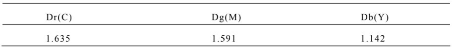
(4) Measure the density of colour block C50M41Y41
Table 6 -7 The solid under different filters of color patch
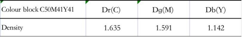
(5) Analytical mask equations

From Table 6 – 3:yr = 0.2943, yg = 0.3407
From Table 6 – 4. mr = 0.4076, mb = 0.7178
From Table 6 – 5. Cg = 0.5248, Cb = 0.32
X = 1 – mb yg – cb yr – cg mr + cg mb yr + cb yg mr = 1 – 0.7178*0.3407 – 0.32*0.2943 – 0.5248
*0.4076+0.5248*0.7178*0.2943+0.32*0.3407*0.4076=0.6018
The individual coefficients in Eq. C are

The individual coefficients tested in equation M are
The individual coefficients in equation Y are
So the masking equation can be simplified from the experimental data as
6.4.3 Verifying inking ratios using the masking equation
(1) Verify colour block C50M41Y41
From Tables 6 – 6 we know that
Substitute into the Jurneyson formula
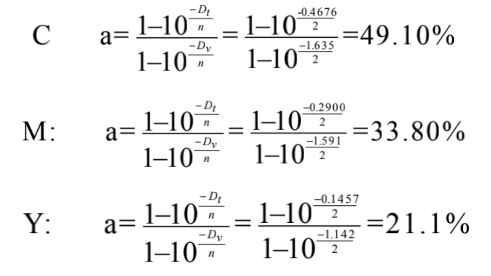
Table 6 – 8Comparison on different dot percent

From Tables 6 – 8 it can be calculated that
The ideal ink distribution ratio as determined by the network is: 50%: 41%: 41% = 1.25:1:1
The actual dot area of the test plate determines the ink distribution ratio: 76.1%: 72.4%: 77% = 0.988:0.94:1 The masking equation calculates the dot area-determined ink distribution ratio: 49.10%: 33.80%: 21.10% = 2.33.
1.60 : 1
Error.
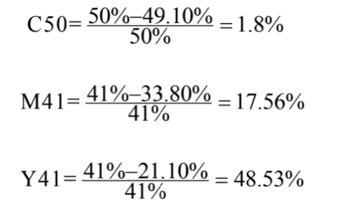
(2) Designing colour blocks
The mesh areas of the three colour blocks C30M30, C60Y60 and M80Y80 were calculated separately from the masking equations, see Table 6 – 9
Table 6 – 9 Calcul ation dot percent of different three color block

Use the data in Table 6-9 to lay out the colour block colours using Coredraw software, as shown in Figure 6-2.

Fig. 6-2 Color bolock of coredraw
From Table 6 – 9 and Figure 6 – 2 it can be seen that the masking equation is highly accurate in guiding the colour matching between colours and the ink ratios are close to ideal.
6.4.4 Monotype equation inking model correction
In this paper, two experiments were designed: a colour matching model based on the masking equation [167] and a colour matching experiment to verify the accuracy of the model. The data from the standard chromatogram was collected as the model sample, and the linear regression coefficients were obtained by using the LINEST linear regression function in the data analysis option of the EXCEL software to obtain the colour matching ratios.
(1) Experimenting with colour matching models based on masking equations
a. Experimental conditions
Experimental equipment: ER-120A electronic balance (accuracy 0.0001g); X-Rite 530 spectrodensitometer; D65 light source, 10 degree field of view.
Experimental material: Designing and printing colour standard chromatograms
Application software : Microsoft Excel 2007
b. Experimental procedure
(a) Twenty complex colour blocks were selected from the designed and printed colour standard chromatograms and measured three times at different locations using an X-Rite 530 spectrophotometer.
(b) Simultaneously, the principal density of each monochrome block was measured from 5% to 100% of the grid area, with an interval of 5% C.
M , Y three times and find the mean.
c. Experimental data
The above method was used to measure and average the data recorded in Tables 6 – 10 and 6 – 11.
Table 6 – 10 Density of standard color block
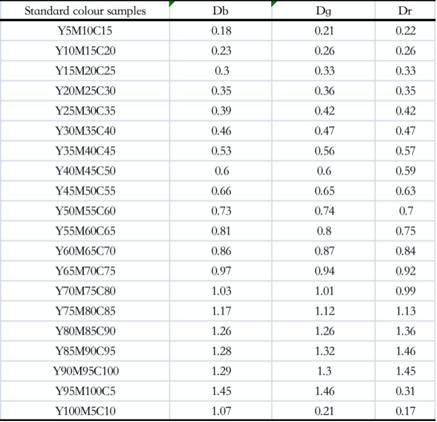
Table 6 – 11 Density of standard colour block
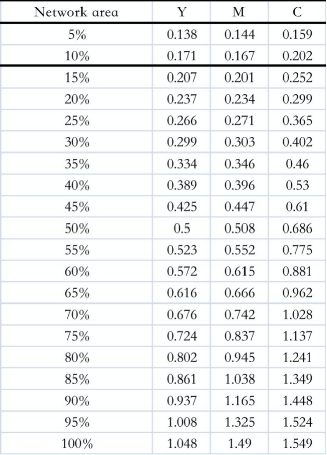
d. Experimental results
The linear regression coefficients are shown in Tables 6 – 12, 6 – 13 and 6 – 14 respectively, and the results are shown in the Appendix.
Table 6 – 12 Value of b 1 ,b2 ,b3
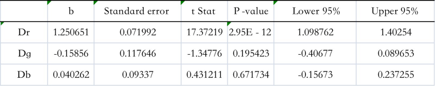
Table 6 – 13 Value of k1,k2,k3
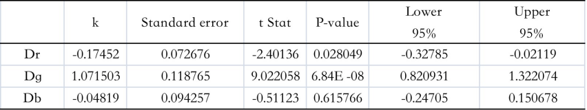
Table 6 – 14 Value of l 1 ,l2 ,l 3
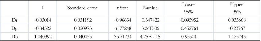
From the results in the table it can be seen that
b1 1.250651; b2 0. 15856; b3 0.040262
k1 0. 17452; k2 1.071503; k3 0.04819
l1 0.03014; l2 0.34522; l3 1.040392
The modified colour matching model is obtained by substituting the linear regression coefficients into the following equation.
C 1.250651Dr 0. 15856Dg 0.040262Db
M 0. 17452Dr 1.071503Dg 0.04819Db
Y 0.03014Dr 0.34522Dg 1.040392Db
6.4.5 Colour matching experiments to verify the accuracy of the model
C 1.250651Dr 0. 15856Dg 0.040262Db
M 0. 17452Dr 1.071503Dg 0.04819Db
Y 0.03014Dr 0.34522Dg 1.040392Db (6 – 9)
(1) Experimental conditions
Experimental equipment: AIC2-5IGT printability instrument; ER- 120A electronic balance (accuracy 0.0001g); X-Rite 528 spectrodensitometer (D65 light source 8, 10 degree field of view, accuracy 0.01)
Experimental materials: 157g coated paper; printing pulp from Changzhou Zhongyu Company Limited; washed out ink; Design and Printing Colour Standard Chromatography by Liu Wuhui; stopwatch; transparent tape; car wash; some cotton cloth
Application software : VC++ 6.0
Experimental environment: temperature 22℃±1 ℃; humidity 60%-70%RH
(2) Experimental procedure
a. A colour matching program based on the established colour matching model and the Yul-Nielsen formula.
b. Using an X-Rite 528 spectrodensitometer to measure the density of each of the nine target colours, input the density values into the program, calculate the actual ink formulation ratio and carry out the actual colour matching.
c. Blend the ink according to the ink formula, then weigh 0.2g of the blended ink empirically and apply it to the leveling roller on the leveling machine for about 60s and 30s. After the samples have dried, select one of them with a uniform colour print and choose five spots on it to measure the L, a and b values with an X-Rite 528 spectrodensitometer and take the average.
d. Measure the L, a and b values of the target colour with an X-Rite 530 spectrodensitometer and calculate the colour difference between the sample and the target colour from the above equation.
e. Take a picture of the sample and the target colour to distinguish the colour difference in terms of colour perception.
(3) Recording of experimental data
The density values for the nine target colours measured with the X-Rite 530 spectrodensitometer are shown in Table 6 – 15.
Table 6 – 15 Density of target color block
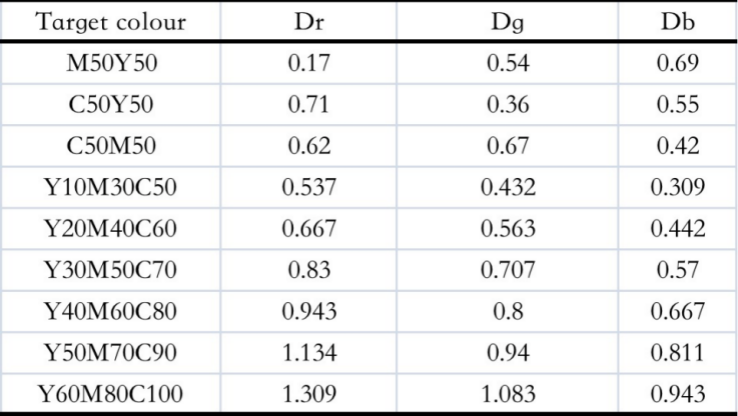
The source code for the colour matching program based on the established colour matching model and the Yul Nelson formula is as follows: #include <iostream>
#include <math.h>
using namespace std;
#define Ds1 1.549
#define Ds2 1.490
#define Ds3 1.048
double f1();
double f2();
double f3();
double C,M,Y;
int main()
{
double Dr,Dg,Db,SC,SM,SY,SW;
cout<<“Please enter Dr,Dg,Db:”;
cin>>Dr>>Dg>>Db;
C=1.250651*Dr -0.15856*Dg+0.040262*Db;
M=( -0.17452)*Dr+1.071503*Dg – 0.04819*Db;
Y = (- 0.03014)*Dr + ( – 0.34522)*Dg + 1.040392*Db;
cout<<“C=”<<C<<endl;
cout<<“M=”<<M<<endl;
cout<<“Y=”<<Y<<endl;
SC=f1();
cout<<“SC=”<<SC<<endl;
SM=f2();
cout<<“SM=”<<SM<<endl;
SY=f3();
cout<<“SY=”<<SY<<endl;
SW = 3 – SC – SM – SY;
cout<<“SW=”<<SW<<endl;
cout<<“SC:SM:SY:SW=”<<SC<“:”<<SM<<“:”<<SY<<“:”<<SW<<endl; return 0;
}
double f1()
{
double y1,n1;
cout<<“Please enter n1:”;
cin>>n1;
y1 = (1 -pow(10,( -C/n1)))/(1 -pow(10,( -Ds1/n1)));
if(y1>1) y1=1;
return y1;
}
double f2()
{
double y2,n2;
cout<<“Please enter n2:”;
cin>>n2;
y2=(1 -pow(10,( -M/n2)))/(1 -pow(10,( -Ds2/n2)));
if(y2>1) y2=1;
return y2;
}
double f3()
{
double y3,n3;
cout<<“Please enter n3:”;
cin>>n3;
y3 = (1 -pow(10,( -Y/n3)))/(1 -pow(10,( -Ds3/n3)));
if(y3>1) y3=1;
return y3;
}
The data in the table above was entered into the colour matching program to obtain the required colour ratios as shown in Table 6 – 16. Table 6 – 16 Colour ratios for the three primary colours of ink
Tab.6 – 16 Ratio of color YMC ink matching
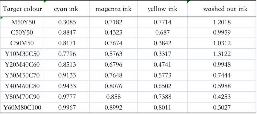
(4) Experimental results
From the strips sampled by the printability meter, the more uniformly printed strips were selected and their L*, a* and b* values were measured using the X-Rite 530 spectral density, and the colour difference formula was used to calculate the difference between the sample and the target colour.
The colour difference between E* ab is shown in Table 6 – 17 and compared in terms of visual effect in Figure 6-3.
Table 6 – 17 Color difference between of proof ang target patches

Target colour Colour Matching


Fig. 6 – 3 Comparison between proof and target colour block
The colour difference between the sample to be matched and the target colour has a maximum value of 33.41 ΔE*ab and a minimum value of 12.66 ΔE*ab, with an average colour difference of 19.85 ΔE*ab.
(5) Analysis and discussion of experimental results
The accuracy of the colour matching model established in this thesis is not satisfactory and there are still large errors. We can conclude from this chapter that the accuracy of the colour-matching model based on the masking equation basically meets the printing requirements and provides some guidance for actual printing; however, there are errors in the accuracy, which are mainly due to.
(a) The masking equation is tested on the assumption that the superposition and proportionality of the ink are valid.
The accuracy of the equation is reduced by the failure of factors such as the ink shot, ink transparency and ink colour quality. In order to obtain a more accurate colour matching model, the masking equation can be modified by regression analysis to establish a quadratic non-linear relationship between the main density of the ink and the ink quantity.
(b) The selection of the modeling samples was not comprehensive, and only 20 sets of standard colour samples of compound colours were selected as the modeling samples, without selecting the standard colour samples of inter-colours. In future studies, the colours can be divided and a colour matching model can be built for each area.
(c) When using the Yul-Nielsen formula, the default value of n is 1. The effect of paper type on the value of n is not taken into account, but in practice the value of n depends on the type of paper used.
(d) In this thesis, the inking process is empirical and does not take into account the effect of the thickness of the ink layer on the density of the colour sample. Even with the same ink, a slight variation in ink thickness under the same printing conditions can cause significant colour differences. This is why it is important to take into account the type of ink, the printing method and the substrate when trying to correct the masking equation. In order to improve the accuracy of the experiment, the ink layer thickness can be controlled in future experiments by establishing a non-linear relationship between the ink layer thickness and the amount of ink applied.
(e) The effect of the difference in ink and printing paper on the experiment has not been ruled out in this paper. The Design and Printing Standard Colour Chromatograms used in this paper were printed on Space Shuttle matt coated paper and New Gold Crown ink, while the ink used in the colour matching experiments was Hang Hua.
(f) The author’s inexperience in colour matching and lack of sensitivity to microscopic colour variation in the ink also contributed to the large colour variation. In future research, the accuracy of the model can be improved by correcting the accuracy of the colour matching model and controlling the thickness of the ink layer on the sample strip.
6.5 Summary of this chapter
This chapter focuses on the theory of the monotype equation. Firstly, the density values of different dot area samples on the standard colour spectrum are tested by spectrodensitometry, and the coefficients of the monotype equation are found using EXCEL. The accuracy of the colour matching model is analysed, which is useful for practical printing.
C 1.250651Dr 0. 15856Dg 0.040262Db
M 0. 17452Dr 1.071503Dg 0.04819Db
Y 0.03014Dr 0.34522Dg 1.040392Db
Based on the established colour matching model, the colour ratios for the target colours were programmed in C++ with the aid of the Yul-Nielsen formula; the colour ratios given by the programming software were used to match the samples with the aid of the chromatographic colour matching method.
The colour difference was measured using an X-Rite 530 densitometer with an average colour difference range of 19.85 ΔE*ab. A method of ink blending suitable for the high temperature heat transfer printing industry was explored.